Renovating an important building comes with a responsibility to honour the past without compromising one’s own vision for it. Homeowners Michael and Claire Cobbledick couldn’t resist the 1970s house designed by a renowned Cape Town architect – even though it didn’t tick the boxes of a family home.
“It was an entirely emotional decision. We knew we wanted it as soon as we walked in. It felt completely welcoming, somehow familiar, reminding me of certain modernist houses, yet entirely singular with its bold geometric aesthetics,” says Michael.
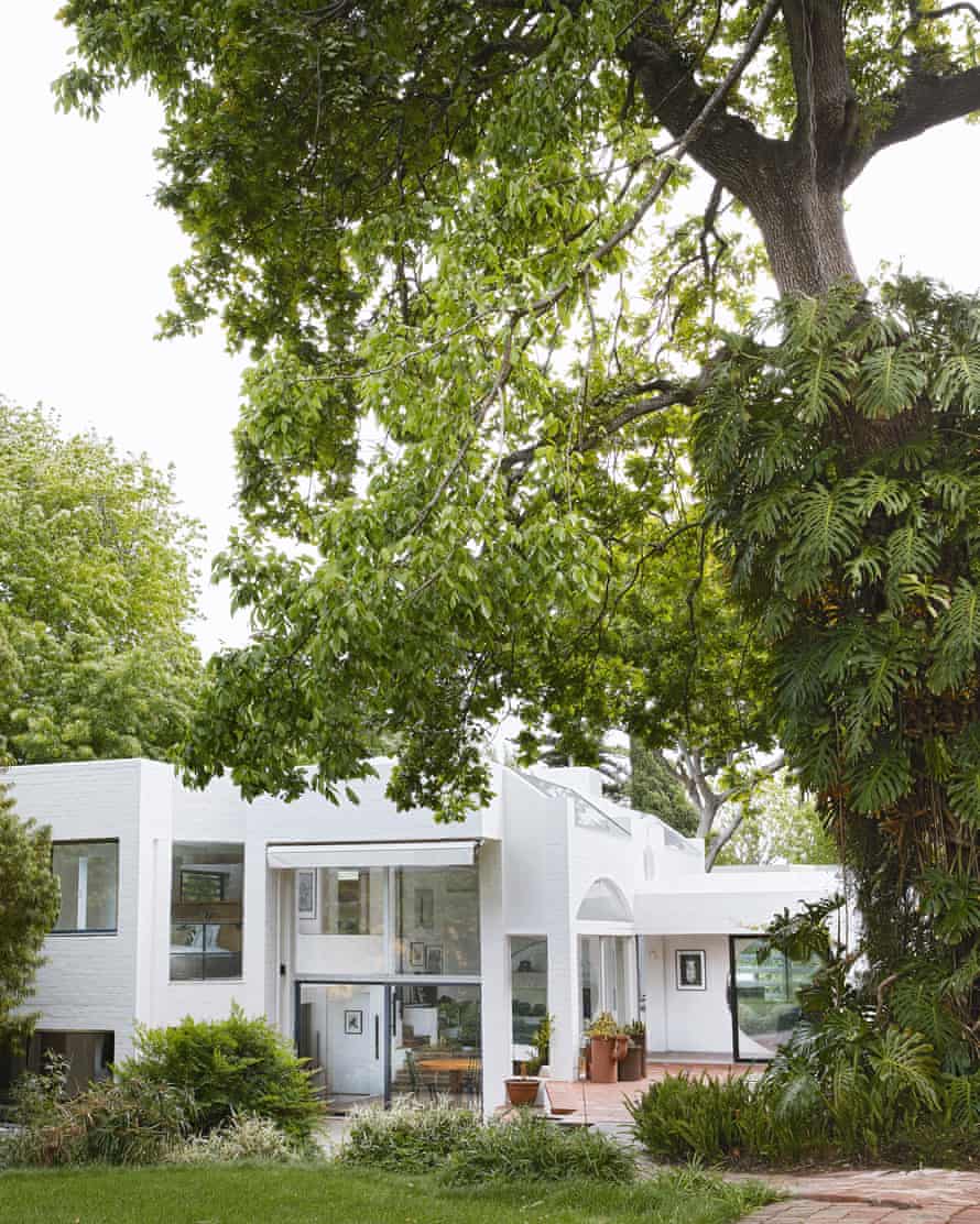
The sense of connectedness inside the house and its relationship to the striking garden was no accident. Designed by Julian Elliott as his family home, it was part of a series of experimental dwellings he was working on at the time.
The garden’s natural slope inspired the design, leading to a three-level creation of connected rooms. The Japanese style “pinwheel” configuration placed the living room at the centre, with every room defined by a grid of 3.5m x 3.5m, the proportions of Japanese tatami mats.
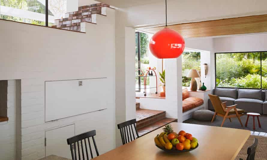
“The original kitchen was very uncomplicated, and the house has Scandinavian influences, so we wanted to reflect that by using a simple, clean beech wood for the table, shelves and bay window inlay,” says Michael.
The European beech table was built by local craftsman Reynier van Zyl of 11th Emotion Joinery and they installed tracking lights and a matte, leathered granite topping for the island as further contemporary touches. The space beyond, originally a ceramics studio, was used to create a scullery, laundry and carport.
The couple approached the project more as a restoration than a renovation, choosing to retain retained the white bagged walls, black steel frames of doors and windows, and original glazed brick flooring used throughout. The principal changes they made were to remove all of the old joinery, taking out room dividers, and streamlining the kitchen.
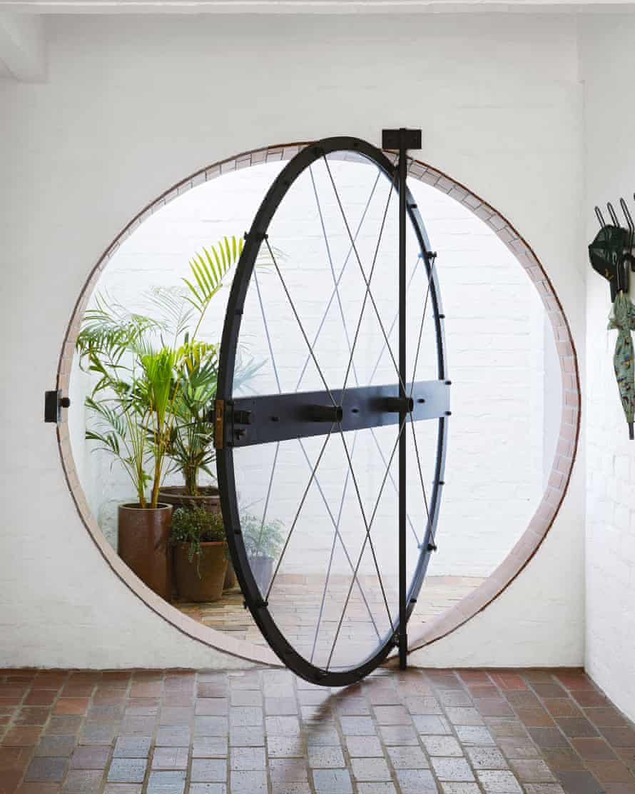
Respecting the journey from the entrance (complete with a quirky, round doorway) to the heart of the house was a priority, explains Michael. Privacy was no longer a concern because the entrance was now enclosed by a new courtyard, so they replaced the fibreglass panes with glass, bringing additional light into the kitchen areas and the TV room, which was previously used as a study. Sunken carpets help to define the space in the TV room, which coheres around a grey modular sofa from Superbalist.
Stepping up from this entrance level into the home’s centre, says Michael, is a cathedral-like experience. When it was originally built, the “auditorium” (the current lounge and dining area) doubled as a space in which to watch movies, using what would then have been a cutting-edge motorised projector screen. High ceilings, a wall of glass and multiple skylights and windows in various shapes and sizes create a kaleidoscope of entry points for light. The room has recessed and overlapping arches and a central fireplace, allowing natural light to fall between the circular arches.
This is Claire’s favourite area. “What I love is that you have different experiences in different seasons. In winter, we congregate around the fire and in summer, we gather in the glassed area looking on to the garden,” she says.
The auditorium area spills out on to the garden which was modernist with Japanese and eastern influences. When the couple arrived it had become an impenetrable forest so they removed non-local trees and cleared shrubbery.
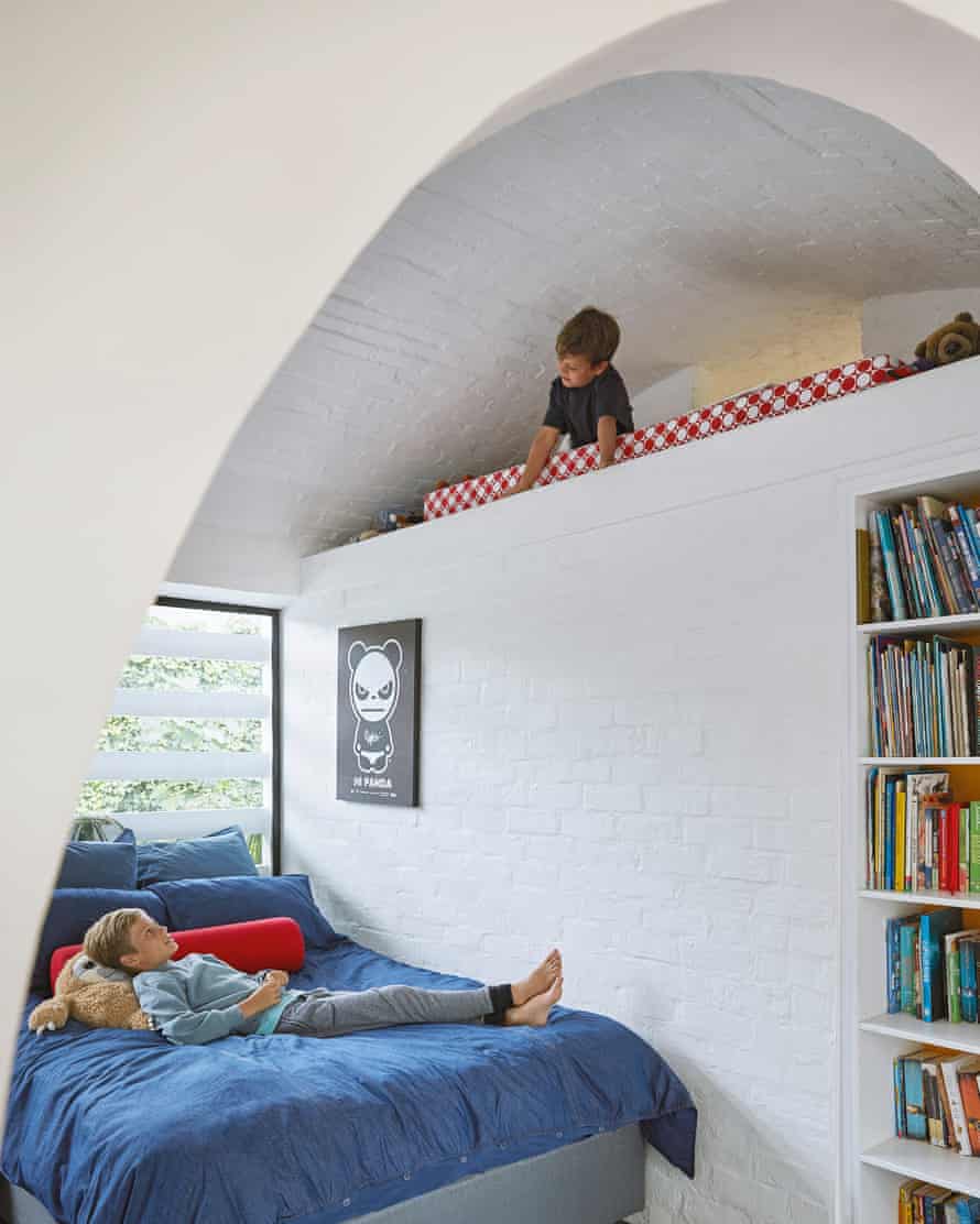
The arches and the vaults over the bedrooms and kitchen are also based on the same 3.5m grid, with the main bedroom a mezzanine, overlooking the auditorium. “I love the outlook from here,” says Michael. “There are so many perspectives and angles. You get a bird’s-eye view and can take in all the features that Elliott chose so carefully to include.”
With a nod to the tatami-inspired dimensions, they installed a modern take on the shoji screen, giving them the option to section off their bedroom and upstairs lounge.
And in honour of the primary colour palette originally used, the couple introduced matte orange taps, bold blue shades on doors and handmade ceramic tiles for the showers. These pops of colour playfully appear elsewhere – as yellow tiles in the kitchen splashback and as the upholstery on fitted seating.
The “modern retro” is celebrated with collected midcentury furnishings and balanced with the couple’s eclectic art choices and collected objects from local markets.
The result is a family home that makes a contemporary statement without losing the soul of the modernist house.
Claire says it has come as a surprise that, despite its sprawling footprint, it works well as a family home – one they share with sons Leo and Tom. “We are together, but independent. Wherever you are, you know where the kids are.”