When John and Kate Cameron were looking to downsize from their Victorian family home in a suburb of Edinburgh after their children left home, they decided to go for a real change: a 1980s brutalist-style brick house in a suburb close to the city centre.
The couple knew and loved the house – built in 1982 by Scottish architect Douglas Abrahams for his own family, and set within a walled garden in one of the city’s most picturesque suburbs – as the previous owners were family members who had lived in it since the mid-80s. But for all its character and charm, it didn’t suit the way they lived.
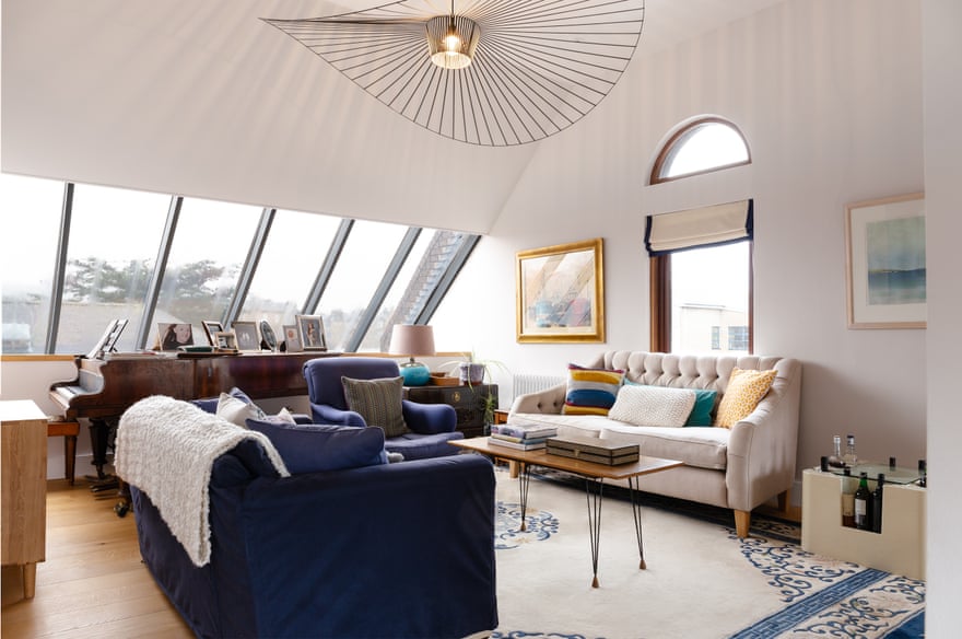
The layout, particularly ground-floor living areas, was warren-like, with compartmentalised rooms (such as the dining room and kitchen, which were separated by a serving hatch), convoluted corridors and unusual level changes. And with few windows to the south the house felt dark and smaller than it was. The bathrooms were also dated and there was a long, narrow sunroom on the first floor that wasn’t really used.
So they decided to radically transform it. “The main idea was to modernise and adapt it without losing the feel of the original house,” says Kate. “The proportions were designed around a smaller person than John, so we removed some of the unusual level changes and stair heights. And we wanted to maximise light and views to the garden.”
They enlisted Edinburgh-based architect Jens Bergmark, with whom they had worked on their previous house. “The challenge was to take care to preserve and refine the character of the house while transforming it in quite a radical way,” says Bergmark. “So, rationalising the spaces, getting rid of all the passages, corridors and cupboards, and improving the layout.

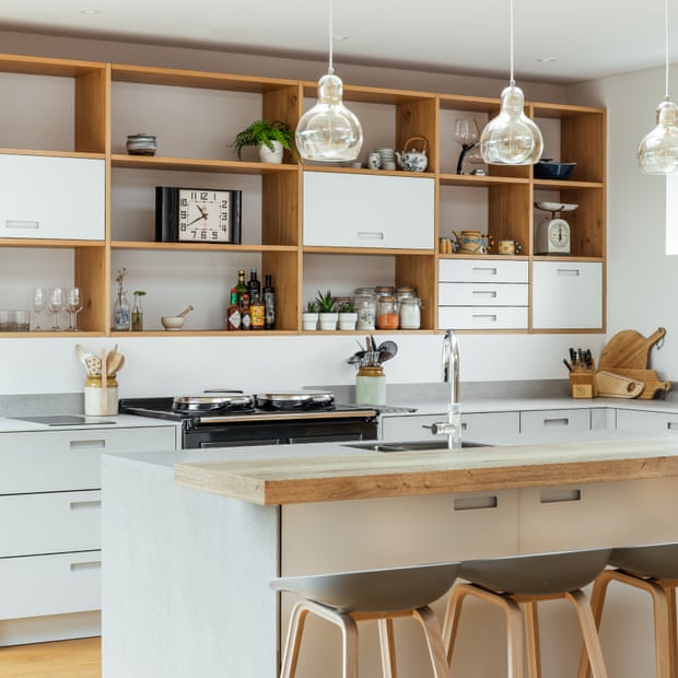
Bergmark’s solution was principally to make the house more open plan, to create a smoother flow. He lifted or lowered the floors in certain areas so that the level changes disappeared, and added an extension with an open-plan dining/kitchen area: this overlooks and encloses part of the south-facing garden, forming a sheltered L-shaped courtyard with a slabbed patio area, edge planting and a much-used pizza oven. On the first floor, the former sunroom was converted into an en suite bathroom and dressing area for the master bedroom.
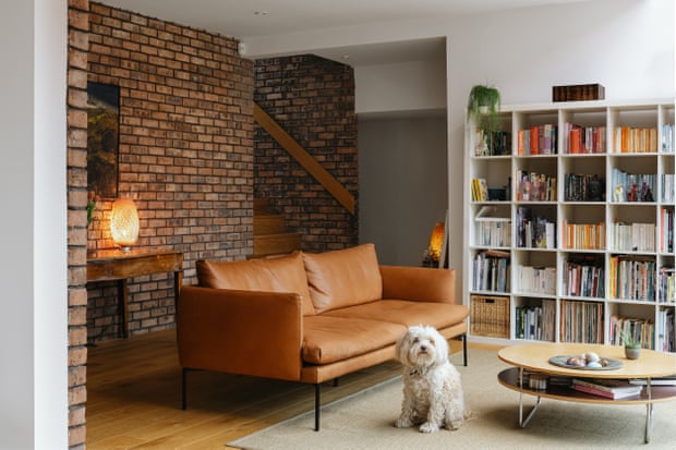
Inspiration for the interiors came from the original house, with an emphasis on exposed brick. The brick that came down in the demolition was reused to clad the new timber-frame garden extension.
Bergmark added light oak floors, replacing the former brick floor of the lounge to soften the space, and moved original bespoke cabinets and shelving to new areas of the house, mainly the dining room, to suit the new layout. Inherited furniture, such as a set of Georgian dining chairs, combine happily with modern designer pieces including a vintage Ikea table and light fittings from Catalog Interiors. They also found room for upcycled armchairs and dining chairs reupholstered by Kate.
One of the key features of the original house was a two-storey self-contained flat to the left of the main entrance. Although connected to the main house, the small, one-bedroom pad could function as separate living quarters, with its own kitchen, living area and bathroom.
“Its living room overlooked the main entrance to the house,” says Kate. This created privacy issues, so Bergmark flipped the whole granny flat upside down, with the kitchen and living room upstairs and the bedrooms downstairs, looking out of the house in the other direction, away from the main entrance. “There is a lot more privacy now,” she says.
The flat proved extremely useful during the pandemic, when it became John’s office. “He can lock the door to it at the weekend and not go back in until Monday,” says Kate. “We also stayed in it while work was going on in the main house.” The granny flat is now self-contained accommodation for visitors.

As part of the renovation, the energy efficiency of the house has been vastly improved, with more insulation and triple-glazed windows. “Opening the house up more to the south has also increased its solar gain,” says Bergmark. “The house is so warm and efficient, light and bright,” adds Kate. “We sit outside way more than we could have imagined.”
Not only is the house ideal for post-pandemic working, it’s also a canny example of updating and refurbishment, ultimately preserving a charming architectural curio. “This project is about a gentle touch,” says Bergmark. “It’s about modifying what you’ve got and not making a big statement. It’s not grandiose. If it looks seamless, that’s a compliment.”


