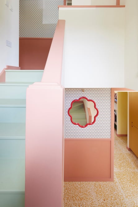
I cringe when people say it’s colourful,” says award-winning author Huma Qureshi. She’s perched on the edge of a blue sofa in the front room of her four-bedroom north London home, where she lives with her partner, Richard Birch, and their children. “It’s not! It’s considered. It’s intentional.” The floor tiles are a faded terrazzo yellow and the walls are pink, with pale green architraves framing the doorway leading into the kitchen-diner. In this home, neutrals serve as accent colours. There isn’t much white, grey or beige in sight, but she’s right, it’s not colourful, it’s brilliant. Behind her a collection of seven patterned wall plates hang next to the cover artwork for her 2021 memoir. “My friend Parul Arora did the cover for the book and she gave me the print,” she says. “These are my take on the plates my mum would buy on her travels and hang up in our family home. It was the sale of that home that led us to this house.”
Huma’s mother was downsizing from their family home in the Midlands and moving to north London to be closer to her children. This was during lockdown in 2020 and she wasn’t able to view houses, so they did it for her. “I saw a tired-looking house and half jokingly showed it to Richard, who is used to me sending him pictures of properties we could never ever live in. He said this actually looks interesting,” says Huma. They went to view it and she distinctly remembers that they were both struck by the light and the big windows on both sides, plus the spacious rooms. “At a certain point in the afternoon the sun comes into the house from the back and front, filling the centre so it glows. There were slices of sunlight coming through and it felt like a summer house. On holiday in Denmark, we fell in love with these traditional, black-painted summer houses and when we saw this place, we immediately knew we’d paint it black on the outside, too.” This is also why she decided on faded terrazzo floor tiles. “It’s as if they’ve been washed out by the sun over time and have been there for years.”
Before taking the 1960s route, the couple had considered buying a new-build property – it would have been more straightforward and less time-consuming. Huma was working on a novel and they had three young boys to look after. But when they went to view some new developments Huma realised she disliked the standard fittings and fixtures, the neutral finishing and decorations; she kept asking if it would be possible to install alternatives. They quickly realised it wasn’t for them. “So we decided to go for this house and we’re the only ones that did.” It had the space they wanted and when she showed her brother photos of the house he said it reminded him of where they grew up. “It didn’t occur to me at the time, but I realise now that there were similarities in the original layout,” she says. Huma and Richard have always had a thing for 1960s properties, she admits: “One of the first presents he gave to me was a stack of books on mid-century furniture.”
The house hadn’t been updated in years – the kitchen wall tiles, beige cabinets and countertops were being held together by heavy duty duct tape. The original owners had bought it off-plan. They lived across the street and watched it being built in 1962. “There was no working shower,” says Huma. “The wall tiles were square and beige, and when we removed them we saw the original blue and white 60s tiles laid in the same chequerboard pattern as I’d planned for the terracotta pink and white tiles we now have. It instantly felt reassuring that we’d chosen what was right for the house.”

m
Mike Manning/Richard Chivers / Astrain Scheldt.
They had another moment of serendipity when the builders demolished the downstairs toilet and removed the mirror. The wallpaper behind it was from Laura Ashley, it was a pistachio colour with scallops. “I’d already chosen the Ottoline paper for the corridor upstairs, which also features scallops and muted colours.”
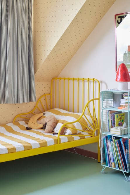
Upstairs the bedrooms branch off the long corridor, a space that used to connect the main house to one of the two disused garages. Huma and Richard engaged architect duo Astrain Scheldt to help them exploit this quirk and they’ve managed to bring a contemporary flair, similar to what you’d find in a boutique hotel. “I like the feeling I get when I go to a hotel and open the door to my own private space, that’s why we intentionally kept the setup of the long corridor here,” says Huma. “I don’t remember when or where I saw images of the Hotel Voltaire in Arles, France, but the simplicity appealed to me.” The hotel is modest, yet considered and throughout Huma’s home the same thought has gone into the details – such as the lining for the Beata Heuman and Fabric Warehouse curtains she designed to divide the rooms of her two eldest sons. They reflect each child’s favourite colour. Huma kept the soft division as the boys weren’t actually keen on having their own rooms after sharing in their previous home for years.
Back downstairs in the kitchen-diner thought has also gone into how each family member moves around the space. “We decided to have open shelving near the dining table so that the children can help set up during meal times,” says Huma. “The new kitchen is by Pluck and the table is from Ikea – it’s about 10 years old. I bought the dining chairs in 2013 with my first book advance.” Near the playroom each child has their own locker. The house has been designed to be organised and livable, it’s practical and at the same time enjoyable. “I find that 1960s houses are purposeful and I love that,” says Huma. “This is a family home, we have Lego left out on the side, but I find that there’s no one area that gets more use. We really enjoy being in all the spaces.”
For more details about Huma, go to humaqureshi.co.uk. Her memoir, How We Met, and her book, Things We Do Not Tell The People We Love, can both be bought at guardianbookshop.com


