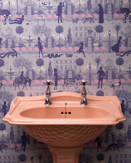
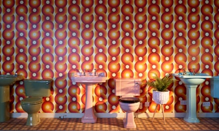
To walk into the Brokenbog warehouse is to walk into a flushable rainbow. Grand porcelain towers of 50,000 toilets, basins and bathtubs are stacked in a Pantone-esque pattern of pinks, greens and blues. To be specific: Flamingo, Melba, Romany, Heather, Pampas, Silver Fox, Sorrento Blue and more, a hundred more, each shade insistently nostalgic in its own specific way.
“When my parents bought a former Corporation house in Stevenage New Town in the 1970s,” says Deborah Sugg Ryan, professor of design history at the University of Portsmouth, “the first thing they did was to rip out the white bathroom and replace it with an aspirational avocado green suite with matching rippled tiles.” A decade later, across Britain the opposite was happening. Ccolour was bleached from bathrooms again, avocado suites making way for minimal white sanctuaries. The popularity ofminimalism in of the 1990s led to spa-like bathrooms, their function as much a place of “wellness” as cleanliness. White metro tiles suggested an industrial space, hygienic and pure, and pleasingly modern. Sugg Ryan charts the rise and fall of the coloured bathroom from 1932, when “speculatively built houses became more affordable and the coloured bathroom suite was a mark of individuality and modernity”. Art Deco geometric styles with black borders led to pastels, “like mint and pink, which were popular into the 1950s when vanity basins became fashionable. Pastels gave way to more muted tones, like beige and the notorious avocado green in the 1970s. The coloured bathroom suite fell out of favour in the 1980s when there was a fad for Victoriana and the return of the freestanding roll-top bath. Until recently, white reigned supreme, combined with built-in storage and beige or grey tiles.” Recently, Sugg Ryan bought a pink sink on impulse, and is very pleased with it.
Thirty-five years ago, as coloured bathrooms started to go out of fashion, Brokenbog bought up a load of factories’ lines that were being discontinued. “Stronger colours from the 60s and 70s,” says Sam Powell, who took over the family business from his dad, pointing up at the burgundy basins above our heads, “and paler ones from the 80s, lots of muted champagne tones – that was before colour disappeared completely in the 2000s.” For years their main trade was providing spare parts for people still devoted to their coloured suites. But recently a new customer has emerged. “A few years ago estate agents would say an avocado suite detracted from the value of the house. But now people are starting to ask for a whole coral pink suite or even more surprising colours. I’ve just got a big commercial job for 20 avocado toilets.” These are customers and interior designers that find Brokenbog on Instagram, or by word of mouth after being disappointed by the glaring whiteness of contemporary bathroom style. Coloured bathrooms are rising again.
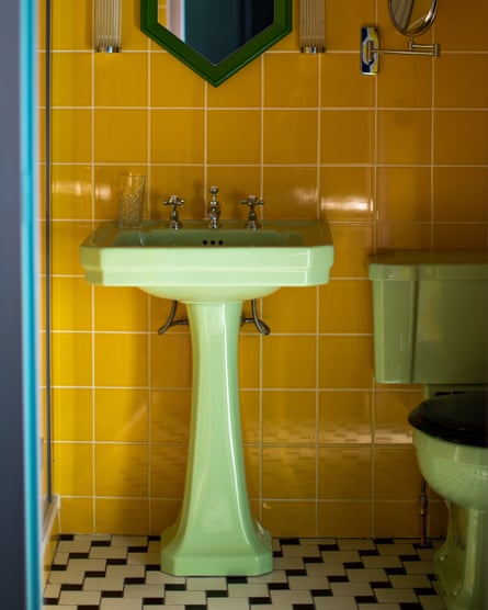
Since moving house a few years ago, I’ve been quietly sizing up my own bathroom for a makeover. A little folder on my laptop contains vivid screengrabs of 1950s bathrooms with baby blue bathtubs and glossy yellow suites from the 1960s, and film stills featuring shag pile carpets and plenty of pink. I want this – glamour and drama, and colour that reflects joyfully off the walls. It was this quest that led me, first to eBay, and a yellow basin in Glasgow and a green bath in Rhyl, then to Brokenbog’s warehouse in Hampshire, where alongside their original toilets and sinks (“The aim is to have one of everything ever made,” says Powell, “from cisterns to seats”), they’re launching their own line of brand new sanitaryware – the Bold Bathroom Company – in colours like Sorbet and Lilac. It was this new collection that designer Luke Edward Hall dipped into when hired to reimagine Hôtel Les Deux Gares, a 38-bedroom hotel in Paris. He installed a series of pastel coloured toilets and sinks in varyingshades of pink and blue, against walls tiled in bold yellows and greens. “One might think it would be difficult to live with a colourful suite versus white,” he says. “The effect can actually feel much more subtle and subdued. I don’t like all-white, clinical bathrooms, I love bathrooms that feel like proper rooms. Somehow taking away all that bright white helps!” He started by sourcing individual pieces of colourful sanitaryware, but ended up shipping the whole lot over from Brokenbog’s Bold Bathroom line. “ I like clashing unusual colours together – so in one type of bathroom, for example, we have emerald green wall tiles, a cobalt blue-framed mirror and a dusty pink suite.” Each is grounded by black and white tiles on the floor. The effect is surreal and pleasingly elegant. You get the sense that when you open the door to one of these bathrooms you’d feel like Dorothy waking up in the land of Oz. “Over the past few years there has been a general shift in the mainstream to people wanting to live with more colour again, which is brilliant to see.” This is inevitably creeping into our bathrooms. “Naturally things also always come in and out of fashion. I think it’s all about viewing ideas through a new lens. The classic avocado suite for example – it’s fun and exciting to rethink how it can work in a 2023 bathroom. It’s about what we choose to pair them with and the rest of the bathroom as a whole.”
Walking through the Brokenbog warehouse, its baths and basins radiating a kind of hopeful glee, I’m drawn towards the pinks. The Pompadours, the Roses, the colours that remind me of pin-up girls and carefully placed bubbles. But as I carry on walking I arrive at the blues, the Cornflowers and Ocean Sprays, and can see how a blue sink might sit prettily beside a pink bath, and then, a yellow loo, Mimosa, Primrose, Creme, perhaps against a very dark wall or bright green tiles – a whole makeup palette within which I could apply my daily makeup. When I got home I called the plumber – the whites had to go I said, I want a new pot to piss in. And I’m ready for joy.

