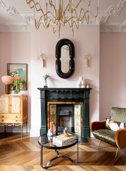
Maria Abou Khalife is a linguist who describes her home as having two styles – perhaps, like herself, it is multilingual. One style speaks to her sleek and minimalist side, influenced by the years she spent living in Copenhagen, the other style is full-on glamour, articulated with the help of interior designer Suzie McAdam. The glamorous drawing room is the room that sold the property to Maria. She describes it as a jewel box: “The detailed cornicing on the high ceiling is beautiful. It needed a complete overhaul, but the Victorian property had what we were looking for.” The couple, while reticent, could envisage the potential.
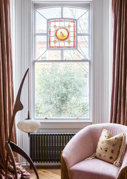
The room is painted in Farrow & Ball Calamine Pink now, with an impressive Il Pezzo Mancante chandelier at its centre and matching wall lights that contrast playfully with the traditional elements. It also features a distinctive stained glass window that they’re particularly pleased with. “We are the only house on the street with this bird design and we were told it had been a wedding present the original owner had received.”
Maria and John met in Beirut where she was born and grew up, they then moved to Dublin before spending a few years in Denmark. “We were both new to Dublin,” she explains. “We moved back to Dublin after Denmark to settle down with our children.” However, Scandi design has had a significant influence on this home.
The couple found the house via a friend who already lived in the area. “I was instantly drawn to it even though it had red carpet and a bunch of unnecessary rooms,” she says. “My husband probably wasn’t as excited about buying an old house because he worried about all the work. He was right to be hesitant, we didn’t know how much of a project it would be and I think we were a bit naive.”
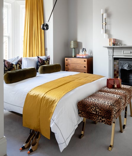
Maria and John engaged ODKM architects to help with the renovation; they navigated several challenges, such as the awkward and small spaces Victorian homes tend to have, including the transformation of the main bedroom suite. “There was a really small bathroom in the main bedroom and we wanted a spacious en suite. We reconfigured the room and have placed the bed against the window,” she explains. “There was no other option, because there’s a fireplace on one side so it couldn’t go there. I love the layout now – it looks very striking.”
The building’s constraints have led to several compromises, and having this en suite meant they lacked storage space for their clothes. “We opened the space out into the smaller room and had Goodwood Designs build the wardrobes,” she explains. It meant that they lost a bedroom, but it works for their needs.
Downstairs, they knocked through, removed and rebuilt everything, including the chimney breast in the middle of the kitchen space, creating an open-plan area “I know it sounds clichéd,” says Maria, “but the kitchen is the most important room in the house nowadays, so it was important when designing to create a large and bright room that would lend itself to family life and entertaining.”
The original layout featured an unused extra kitchen; what is now the playroom was a dining area that featured a random sink. “It felt like there was room after room – I think they just kept adding over the years.” Maria doesn’t like clutter so that setup didn’t work. She chose a functional and minimalistic-style kitchen by Dean Cooper & Company. “I went for a seamless design and wanted the island to look more like a piece of furniture than an actual island,” she says. “Everything in the kitchen had to be hidden so if you go into the room, you know it’s a kitchen, but you don’t see all the extra clutter.” The bespoke kitchen looks timeless because of the muted tones and colours they’ve chosen, while the Gustavo Bittencourt dining chairs covered in Dedar fabric and CTO pendant add refined glamour.
Back in the drawing room the couple had the distinctive stained-glass window restored. “I think it’s my husband’s favourite feature in the house,” Maria says. “When John’s godfather visited us, he said he’d seen it in a book on Victorian Dublin. When he showed us the book, we were so surprised that it was the same window. That’s why we love that particular feature. It has influenced the interior design; all the colours in that stained glass have been reflected in the rest of the room.”


