Retired couple Patricia Lynch and Gwen Williams had been living in their north London terrace for more than 20 years when they realised they had a tough decision to make: renovate or relocate. Lynch bought the house in 1999, the year she met Williams, who moved in with her two years later. They had both fallen in love with the Tottenham area over the years, but the house wasn’t working for them in its current state. The pandemic lockdown finally prompted them to make a decision: to either spend their twilight years in the house they’d grown so fond of, or move and start afresh.
“We loved that we could walk our collie on the nearby marshes, and go to the theatre and be back by 11 – there’s a lot to be said for that,” says Williams, a retired solicitor. “We looked at other areas, but the housing stock was more expensive and it just didn’t make financial sense to move; plus our social life was here in Tottenham.”
Having settled on staying put, the couple decided this couldn’t be a run-of-the-mill extension project – it would have to be extraordinary. “I thought, if we’re going to stay here for the rest of our lives, I want to wake up each morning to something that excites me and makes me happy, not a boring, boxy house,” says Lynch, a former furniture restorer.
The pair had already extended into the side return, but felt they weren’t using the space efficiently. The middle of the house had effectively become a dumping ground and corridor between the kitchen and the living room, and they wanted to turn the loft into a guest suite. Hunting for an architect during lockdown was tricky, but the pair finally settled on Bradley Van Der Straeten (BVDS), inspired by the practice’s imaginative transformations of Victorian terraces.
“We start every project with a deep dive into everything the owners want,” says architect Ewald Van Der Straeten. Lynch and Williams cited brutalist buildings, including London’s Barbican, and the lobby of the Chrysler building in New York, as inspiration, but it was a particular piece by artist Donald Judd (Untitled 1963) that piqued their interest. “We’d seen an exhibition of his work and were really drawn to his pattern formations,” says Williams. Judd’s work became the catalyst for the distinctive curved ceiling that would define the ground-floor extension, and the strong use of colour throughout.
Work began in April 2021, with the pair moving into a friend’s house. “Victorian houses are notoriously cold, so we used eco-friendly cork insulation throughout, as well as installing high-performance double glazing,” says Van Der Straeten. Lynch and Williams invested in an air source heat pump, which cost about £14,000 and is partially powered by five new solar panels. Heat pumps are three to four times more efficient than boilers, but the home needs to be airtight.
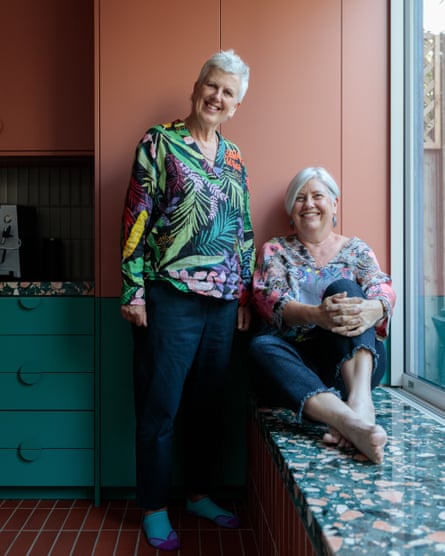
BVDS worked with the existing footprint of the extension, extending the length of the middle room by a metre into the kitchen. This created a usable dining area for entertaining, and it’s connected to the kitchen, which used to house a dining table. “We now have room for an island and it feels much more integrated – we can be together in the space, but not step on each other’s toes,” says Williams.
The ground floor is a celebration of pattern, texture and colour, with the house divided by a “spine” of fluted tiles that also wrap around the kitchen island. A wave of cobalt-blue corrugated concrete tiles ripples across the rear extension. “Adding indoor-outdoor seating has made such a difference to how we use the space, and has reignited our interest in the garden,” says Lynch.
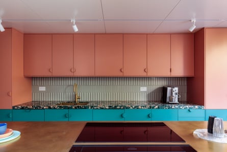
The kitchen is mainly in earthy terracotta, with candy-like terrazzo worktops, sea-green units and a statement brass island countertop. “I like everything pristine,” says Lynch, “so I’m having to live with the fact that the brass will develop a patina over time.” A pegboard wall also satisfies Lynch’s desire for order – the shelves are cut to Fibonacci number lengths, a nod to Judd’s mathematical “progression” sculptures. “It’s nice to be able to swap objects around to keep things interesting,” says Williams.
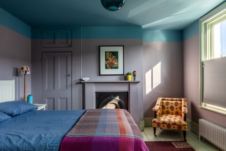
Upstairs, a combination of mauve, mint and blue creates a cocooning effect in the main bedroom. The bold use of colour culminates in a hot-pink stairwell that leads up to the attic, inspired by the colour palette of Mexican architect Luis Barragán.
“I love how joyful the colours are and how they’ve transformed the way we feel,” says Lynch. “I adore the pink in my sewing room in the loft. It feels like we have a brand-new house – we want to spend the rest of our years enjoying it.”

