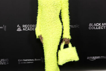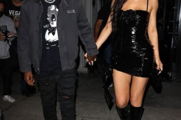
Mastering monochrome dressing represents the pinnacle of sophisticated menswear, requiring precise execution to avoid appearing flat or uninspired.
In this comprehensive guide, we’ll provide exact specifications for creating impeccable tonal ensembles, drawing from both high-end luxury brands and accessible alternatives.
The foundation of successful monochrome dressing lies in understanding colour temperature and undertones.
Rather than simply choosing “blue” or “grey,” you must first determine whether your chosen colour has warm or cool undertones, as this affects every subsequent piece in your outfit.
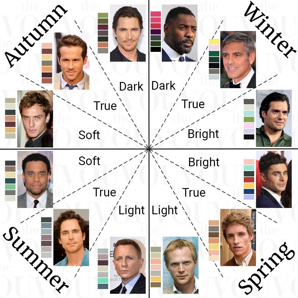
Begin by examining your skin undertone in natural daylight. As a generic rule, cool undertones pair harmoniously with colours containing blue or purple bases, while warm undertones complement colours with yellow or red bases.
For a more accurate analysis, here is a quick quiz to determine your unique seasonal colour.
The natural compatibility ensures your monochrome outfit enhances rather than washes out your complexion.
For precise colour selection, use the Pantone Fashion Colour System as your guide, selecting one specific shade number that will serve as your reference point.
This systematic approach eliminates the guesswork from colour matching and ensures consistency across different brands and materials.
For navy enthusiasts, select Pantone 19-3921 TPG as your foundation, achievable through Tom Ford’s O’Connor suit line or Suit Supply’s Napoli range, ensuring all subsequent pieces match this specific tone rather than attempting to coordinate multiple variations of navy.
When working with grey, calibrate all pieces to Pantone 17-4402 TPG, exemplified in Brunello Cucinelli’s signature knitwear collection or Uniqlo’s Merino range, maintaining consistency across all layers.
Incorporate Three Different Fabric Textures Within Your Selected Shade
Texture variation prevents the outfit from appearing two-dimensional while maintaining colour consistency, serving a crucial purpose in monochrome dressing.
The key lies in understanding how light interacts with different fabric surfaces, creating visual depth without introducing new colours.
The optimal approach involves selecting three distinctly different fabric textures that occupy different proportions of your silhouette.
Begin with your largest surface area (typically your outerwear) in a textured weave, your middle layer in a medium texture, and your base layer in the smoothest finish.
Combine a cable knit with brushed wool trousers and a smooth cotton shirt, ensuring each texture occupies a different proportion of your silhouette for optimal visual interest.
You can achieve this through luxury pieces from Loro Piana or accessible alternatives from Marks & Spencer.
Layer a herringbone overcoat over a plain merino wool jumper and flannel trousers, creating depth through contrasting weave patterns within the same colour spectrum.
You can achieve proper texture variations with pieces from Kiton (or Mango as an affordable alternative).
Adjust Shade Intensity Between Upper and Lower Body Using the 70-30 Rule
The distribution of light and dark tones across your body follows the natural way humans perceive proportion.
Scientific studies in visual perception have shown that our eyes naturally seek balance in the upper portion of what we observe, which translates directly to how we should construct our outfits.
The 70-30 rule dictates that lighter shades should occupy the upper 70% of your visual proportion, while darker tones ground the look in the bottom 30%.
The 70-30 ratio creates a natural, balanced silhouette that draws attention upward toward your face.
Position darker pieces like charcoal wool trousers on the lower body, occupying 30% of your visual space, whilst lighter pieces like a pearl grey cashmere jumper command the upper 70%.
The 70-30 principle applies whether choosing pieces from Saint Laurent or Cos.
For all-black ensembles, incorporate matte black trousers with slightly more luminous upper pieces like a black silk shirt, creating subtle variation through texture and finish.
Space Secondary Elements 20cm Apart to Create Visual Balance
The human eye naturally seeks patterns and rhythm in visual compositions. In fashion, this translates to the strategic placement of secondary elements like accessories and layer transitions.
Research in visual merchandising has shown that maintaining consistent spacing between elements creates a sense of intentionality and harmony.
The 20-centimetre rule derives from classical proportions in art and architecture, specifically the golden ratio when applied to the average male torso.
The 20cm spacing creates enough separation for each element to be appreciated individually while maintaining a cohesive relationship with adjacent elements.
To implement 20cm spacing, begin at your primary focal point (typically the face or collar) and measure downward, placing each secondary element at precise measurements 20cm intervals.
This systematic approach ensures your accessories and layer transitions create a pleasing visual rhythm.
Position a wide-weave leather belt exactly 20cm below a silk pocket square, creating rhythmic visual breaks in your monochrome palette.
The 20cm principle works effectively with both Bottega Veneta accessories and Reiss alternatives.
When wearing layers, ensure precisely 20cm of each layer is visible, achieved through careful trouser break positioning and sleeve length adjustment, maintaining Tom Ford’s recommended proportions for elegant layering.
The strategic placement of metallic elements near the face serves multiple psychological and aesthetic purposes.
Research in colour theory demonstrates that metallic finishes act as neutral reflectors, subtly highlighting skin tone while creating a sophisticated point of interest.
The 15-centimetre zone around your face represents the primary area where others focus during interaction.
By placing a metallic element within this zone, you create a subtle anchor point that draws attention upward while maintaining the integrity of your monochrome palette.
Select your metallic finish based on your skin’s undertone: silver or white gold for cool undertones, yellow gold or rose gold for warm undertones.
Secure a silver tie pin exactly 15cm below your collar point, creating a subtle light-catching detail that complements your chosen palette.
This can be achieved with either Cartier accessories or more affordable alternatives from premium preppy brands like Brooks Brothers or J Crew.
Alternative options include brushed silver collar bars from Tateossian or The Tie Bar, positioned precisely at the collar points to frame the face effectively.
Match Your Socks Precisely to Your Trousers’ Pantone Shade for Unbroken Lines
The principle of continuous line in fashion stems from architectural design, where unbroken visual flow creates an impression of heightened elegance.
In menswear, the principle of continuous line translates most critically to the transition between trousers and shoes, where socks play a crucial role.
The science of peripheral vision explains why sock matching is vital: while people may not consciously register your socks, their subconscious mind notices any break in colour continuity, particularly during movement.
This subtle disruption can undermine the sophistication of an otherwise perfect monochrome ensemble.
To achieve perfect sock matching, use your trousers as the reference point, not your shoes, to ensure any glimpse of your ankle during walking or sitting maintains the visual line of your legs.
Invest in Pantone-matched socks from Loro Piana’s made-to-order service or Uniqlo’s colour-matched range, ensuring the exact shade match when your ankle becomes visible whilst walking or sitting.
For maximum consistency, purchase three identical pairs of socks for each trouser, replacing them simultaneously when any signs of fading appear to maintain perfect colour harmony.
Match Natural Button Materials Within One Shade Gradient Across Your Outfit
Button consistency represents the finest detail level in monochrome dressing, yet it follows the same principle as larger elements: maintaining cohesive colour flow.
When using natural materials like horn or mother of pearl, each button contains subtle variations in its pattern and colour tone.
The key is to ensure these variations remain within a controlled range.
Buttons serve as visual punctuation in an outfit, and their spacing creates a subtle rhythm. Select buttons where the darkest part of one button is no more than one shade darker than the lightest part of any other button in your outfit.
Begin by selecting your button material based on your outfit’s undertone: brown horn for warm colours, mother of pearl for cool colours. When examining natural button materials, place them side by side in natural daylight and ensure their colour variations fall within a single shade range on a standard colour gradient card.
Select horn buttons from Turnbull & Asser’s bespoke service or The Button Queen’s premium range in precisely matched brown or mother-of-pearl tones, ensuring no more than 2mm variance in the natural patterns.
Replace standard buttons on high street purchases with exact matches to your luxury pieces, creating consistency across price points while maintaining the integrity of your monochrome palette.
Related Questions
How many pieces should a monochrome outfit contain?
The optimal number of visible pieces in a monochrome outfit is five: outerwear, top layer, base layer, trousers, and shoes.
This allows sufficient opportunity for texture variation while maintaining a cohesive look.
Each additional piece increases the complexity of colour matching exponentially, potentially compromising the outfit’s harmony.
Should accessories match exactly in a monochrome outfit?
Leather accessories should match within one shade of each other on a colour gradient card, while metals should be identical in tone.
A black leather belt, watch strap, and shoes should appear to be cut from the same hide when placed together, while all silver elements should share the same finish, whether brushed or polished.
How do I handle pattern in a monochrome outfit?
Patterns in monochrome outfits must remain within the same colour family while varying in scale.
When using multiple patterns, maintain a 1:3 ratio between pattern sizes – if your overcoat features a wide herringbone, your shirt should display a pattern one-third the size, such as a fine stripe or micro-check.
Can I mix black and navy in a monochrome outfit?
The key to mixing black and navy lies in understanding their undertones. Navy contains blue undertones, while black is neutral.
Success depends on maintaining at least 30cm of vertical space between these colours, allowing each to establish its own zone without competing.
Combine navy wool trousers with a black leather jacket, using texture to further differentiate the shades.
How do I prevent my all-grey outfit from looking bland?
The secret to a dynamic grey monochrome outfit lies in understanding value gradients. Incorporate exactly three grey tones separated by 15% intensity on the Pantone scale.
Layer a light grey cashmere rollneck with mid-grey wool trousers, topped with a charcoal overcoat, ensuring each shade is a distinct yet harmonious ensemble.
What shoes complete a monochrome outfit?
Shoe selection follows the principle of grounding.
Select shoes that exactly match your darkest garment’s shade, ensuring consistent tone through all leather elements, including the sole edge.
This creates a solid foundation that anchors your entire monochrome look.
How do I adapt monochrome dressing for different seasons?
Seasonal adaptation in monochrome dressing focuses on fabric weight rather than colour variation.
Summer requires lighter fabrics like tropical wool and cotton, while winter calls for heavier materials like flannel and cashmere, all maintaining the same precise colour matching but creating visual interest through texture weight.
What is the maximum acceptable shade variation in a monochrome outfit?
The maximum acceptable variation between any two pieces in a monochrome outfit is three steps on a standard colour gradient card, approximately 15% in technical terms.
This allows for subtle depth while maintaining the monochromatic integrity of the ensemble.
Final Thoughts
Mastering monochrome dressing requires understanding both the scientific principles behind colour harmony and the practical application of these rules.
Success lies in maintaining exact measurements between elements whilst selecting pieces that align perfectly with your chosen base tone.
Remember that successful monochrome outfits result from deliberate choices rather than coincidental matching, requiring investment in properly colour-matched pieces from either luxury houses or carefully selected high street alternatives.
When executed correctly, a monochrome ensemble represents the highest form of sophisticated dressing, demonstrating both confidence and precise attention to detail.
Style Like a True Gentleman
Before we say goodbye, here’s one of the best-kept secrets in men’s styling circles, a secret that only a few expert image consultants know or are willing to share.
First and foremost, professional styling requires knowing your unique body shape and seasonal colour palette – paramount factors in choosing perfectly fitting clothes in colours that complement your skin, eyes, and hair.
Only then can a stylist engage in styling by occasion, location, season, and time of day, with garments, footwear, and accessories from stylistically relevant heritage fashion brands to depict high confidence and success.
Best part? You can find your body shape, seasonal colour palette, and ideal fashion style in less than 5 minutes by yourself, for free, thanks to our four simple steps:
1. Find Your Body Shape
Different garments flatter different silhouettes, so knowing your body shape is the first step in dressing like a confident man.
To find out your unique body shape, take our free body shape quiz for men.
Once you know your unique body shape, take the second free quiz to discover your unique colour palette.
2. Find Your Unique Colour Palette
Remember, the garments that compose your outfits come in various colours, and you must ensure that each hue complements your natural colour.
To do that, you have to find out your seasonal colour palette, and you can do it by taking our free seasonal colour quiz for men.
3. Find Your Ideal Fashion Style
By now, you should already know your body shape and unique colour palette; the next step is to discover your ideal personal fashion style.
The fastest and simplest way is to take our free fashion style quiz for men; it includes your ideal style, outfit ideas, relevant fashion brands, and much more.
4. Professional Image Consultancy with The VOU
And if you want to style like a professional, by occasion, location, season, and time of the day, you can always ask our expert image consultants and fashion stylists for help.
Our styling services for men are the most comprehensive and detailed on the market, backed up by leading stylists who will guide you step by step in creating looks that communicate affluence, elegance, and endless accomplishments.
Remember, wearing luxury brands isn’t enough; to look stylish, confident, and successful, you must first know your body shape, colour palette, and ideal personal style, and only then style by occasion, location, season, and time of day.
Contact us today to save headaches, time, and money – it’s time to dress like a confident, successful gentleman of exquisite fashion taste – the first styling assessment is on us!
With years of expertise in high-end fashion collabs and a PhD in Sustainable Fashion, Ru specialises in curating eco-luxe wardrobes for the modern gentleman seeking understated refinement.


