When Alex Holloway first watched the Verve’s music video for their 1997 Lucky Man single, he found his attention wandering from the guitar-strumming, Mod-mopped lead singer to the interior. The location was a quintessentially 90s industrial-style apartment designed by Richard Rogers. But it was not the floating staircase or steel-framed windows that piqued the future interior architect’s imagination. It was the kitchen. The surfaces were made from that dimpled stainless steel you usually find in your local chippy. To the sci-fi-loving teenager Holloway, who also spent a lot of time “hanging around fast food outlets”, it was just the thing: futuristic, urban and cool.
“It proved you can elevate the most basic material if you design it well,” says Holloway, who co-founded his architecture and interiors practice, Holloway Li, with architect Na Li in 2015. “I decided that if I could ever afford my own flat, I’d use it for my kitchen.”
A chippy-inspired kitchen is not the only unusual thing about the north London apartment where Holloway lives with his partner, Elle Parmar Jenkins, an antiques dealer. After more than a decade of flat sharing, “Where you can’t even hang a picture without annoying your house mates”, he felt “liberated to do things differently”, in the property which he bought in 2019. Holloway, who began his career at the Soho House group, specialises in hotel and co-living projects. Like his mainly millennial audience, he favours “High and low cultural references: a bit of street vernacular with good, classic design”. The country-house aesthetic is not for him. “Fun, and a sense of adventure” are. This home is his test bed for new materials and ideas.
He was lucky that the Victorian building is not listed. So, with his amenable brother on hand to help, he went back to brick, jettisoning the partition walls of the formerly boxy layout. He made use of the hallway space, opening the small second bedroom so that it flows into the wide living and cooking area. The ceiling was removed – “releasing two centuries of dust” – and beams installed to echo the warmth of the wide floor planks. This is a corner property, so he added two new windows at either end. Now the top floor basks in “morning light, and sunsets… It has a nicely continental feel.”

He also likes the way the metal kitchen works with the sunlight, throwing “beams of light across the room like a disco ball”. The carcasses are high-street with that textured metal surface – circle brush steel, to those in the trade – stuck on for designer effect. It sings against the fresco-pink plaster of the walls: “You can drill it and repatch it without having to redo the whole room. We like its lived-in texture and the way it complements the floor. It has a Quaker-ish simplicity.”
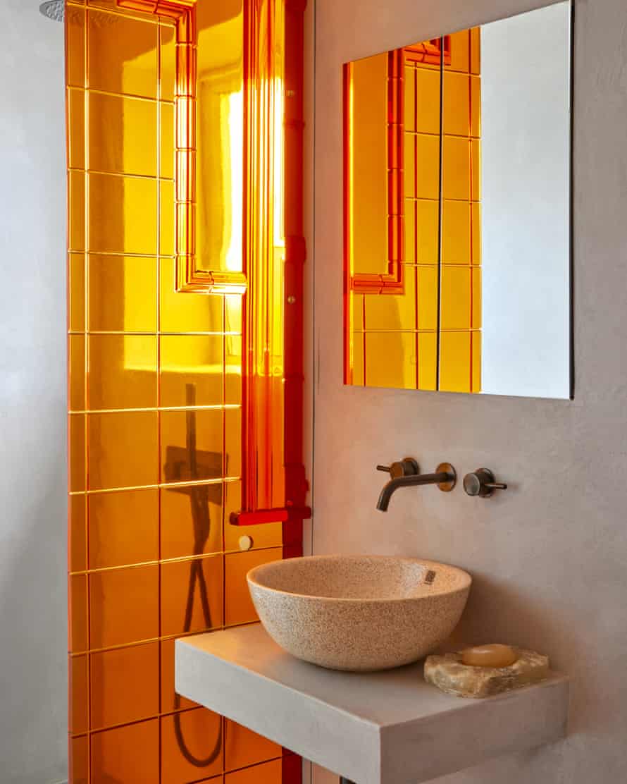
The dining table is another experiment. It is cut from a resin panel originally designed for a shop display. He used the versatile material – “You can dye it, carve it, it’s a bit like wood” – to make the shower-room panel and bedside table. A resin sculpture glows like a futuristic totem under the kitchen window.
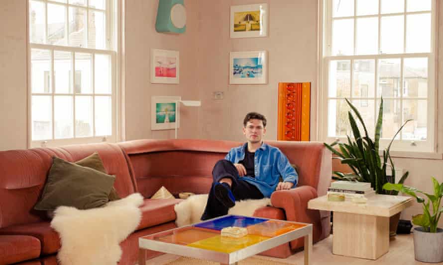
The zingy orange of the table – another Stanley Kubrick-esque reference – is picked up in a curvy fibreglass chair. It was designed by Holloway’s studio and – in a nod to street architecture – is made by a Turkish company that also fits-out the interiors of London buses. Opposite, the sprawling 1970s corner sofa, complete with built-in shelf, comes from Parmar Jenkins’s furniture shop, Goods In, where she also restores vintage upholstery. Surplus stock often finds its way into the apartment. “Friends say it looks like a showroom. Because it is. We experience new things before they’re sold. It adds to the air of change.”

Stone skirtings were inspired by work for commercial kitchens, where vinyl floors are curved upwards at the edges to deter rodents and make it easier to clean. This is Holloway’s “elevated version” and it suits the fastidious side of his nature: “I’m rather obsessed with cleaning.”
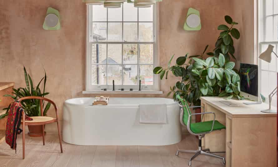
Lockdown, when most of the work took place, allowed extra time for mopping, and “boredom bathing”. There was not enough room in the bathroom for a tub. So, he tucked it under the window of the open-plan office, opposite the kitchen, threading the taps through the windowsill. “During lockdown one of us would be in the bath while the other was at the desk.” The tub-in-room is a boutique-hotel trope, but on-show ablutions are not for everyone. Holloway knows that, which is why he designed the space to be flexible. New owners can reinstate the wall if they want. “But for the moment I didn’t want to be hamstrung by thoughts of future buyers. I wanted to enjoy the space, just as I encourage my clients to do.”
Some can be slow to embrace novelty. But Holloway hopes that when people see his laboratory of ideas, they will come round to his way of thinking. “I believe that if you can justify something in terms of ergonomics, quality of design and usefulness, people will be more receptive to new ideas.”


