For two years from 2017, I was subletting a flat in Stockholm, and the deal was that it would contain everything except the owner’s clothes and some of her books. This suited me as I hadn’t taken anything with me except clothes and some books.
My new abode scored almost full marks on the Millennial Apartment bingo card, created in 2018 by Laura Schocker for the Apartment Therapy website. It featured 24 mainstays of home decor to tick off, and went viral online. In my flat’s sitting room, a neon “love” sign was fixed over the brass bar cart. There was a faux cowhide rug here and a Berber-style rug there. It also had an Eames knock-off chair, a marble table with rose-gold legs, kooky contrasts between round, soft things and hard, angular things, and plants everywhere. Edison light bulbs in rose-gold cages, brass pineapple bookends either end of a shelf peppered with mini cactuses … it had the lot.
None of these things were bad in themselves, but the cliche of it all made me feel queasy. And I vowed that when I was able make my own choices, I would be different. My flat would be recognisably mine, not an amalgam of things I had seen on Instagram.
When I returned to London, I bought some furniture of my own: a wood-and-iron coffee table from Wayfair, a mustard-yellow armchair in the Habitat sale. But then I began to notice something. My furniture, pieces I had carefully selected from various retailers, was in other people’s homes. Or rather, if not my furniture, furniture suspiciously like my furniture.
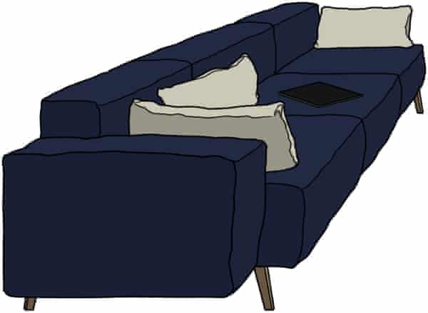
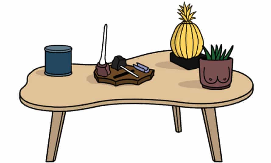
I struggled to describe the style a lot of my friends had adopted. It wasn’t quite the bingo card look – no rose gold and millennial pink – but it was close. It was mid-century-ish – often with clean lines and exposed wood – but not strictly so. Often it had industrial finishes: tables with black metal legs, curvy sofas atop narrow legs that looked at once sturdy and spindly.
Where did this pastel-scalloped-modernist look come from? How has it weaselled its way into everything from estate agent show homes to Harry Styles’s new album cover? I asked interiors writer Nathan Ma what he would call the style. “A millennial perversion of mid-century,” he said.
Let’s call it mid-century millennial, then, because it does feel quite generational. Or perhaps that should be Made-century millennial, as the furniture company Made.com seems to have a particular chokehold on both this style and youngish furniture buyers. It more than doubled its UK warehouse space last year thanks to the lockdown furniture boom, and reported a 38% increase in sales at the start of this year, despite supply-chain issues.
It’s a company whose furniture seems to gesture at taste that is affordable (for those who have moved on from Ikea) but without the price point of designer goods. When I started asking where friends had bought their Scandinavian-ish dining chairs and velvet sofas with toothpick legs, “Made” was often the answer. For many, Schocker told me, “anything mid-century is really equated with quality”.
Looks can be deceiving, though. These dupes often look great on the website and are fine to sit on in a showroom for three minutes, but are not always as comfortable as they look. I asked a friend how he came to own not one but three Made sofas.
“They felt a touch more sophisticated than Ikea, but with each one I realised they were deeply uncomfortable,” he said. “One grey sofa was rock-hard.”

In the US, a 2017 article about West Elm’s particularly dissatisfying Peggy couch (named, predictably, after the Mad Men character) went so viral that the company ended up offering refunds to anyone who’d bought it.
Milly Burroughs, who used to work in furniture PR, told me the mid-century trend has been around for about a decade. “It’s a trickle-down from the high-end stuff, the same as you see in fashion.” In 2013, she noticed at trade fairs that Danish brands such as Gubi were bringing out new takes on mid-century furniture. “They would get picked up by a hotel, or a restaurant, then people see them and want them in their homes.”
The reign of the mid-century aesthetic may seem arbitrary, but it’s the opposite of what many millennials grew up with in their parents’ homes. “I was surrounded by lots of Victorian-esque layering, florals, chintz, colour,” says furniture designer Sheena Murphy. “And maybe we got tired of that.”
And for younger people, who are often renting and moving around a lot, mid-century millennial pieces suit because they are relatively compact. Because mid-century has been around since, well, the mid-20th century, it will also fit into homes from new-build flats to Victorian conversions. And the genius of companies like Made is that while every piece is different, they all fit this same vibe, can be mixed and matched with ease, and work with other millennial trends such as wonky vases, enamel crockery and raffia place mats.

There’s a comfort in mid-century’s perceived timelessness: it feels like a safe bet, something you want to own for the next decade at least. And as it’s everywhere, it’s reassuringly familiar to buyers.
I asked Ali Edwards, design lead at Made, why sort-of mid-century was so appealing. “In uncertain times, people often revert to what they know best,” she says. Murphy speculates that maybe it has such longevity because it felt futuristic when it appeared 80-odd years ago: “Perhaps that’s given it a little more runway.”
I remember when I got my mid-century bookshelf and my mum said, in as loving as way as possible, that it looked like something a grandmother would own. Perhaps furniture trends skip generations and my kids will decorate their moon-colony bedrooms with frilly, flowery cushions.
But now that it is so ubiquitous, the mid-century millennial style is no doubt set to wane. So what might come next? Everyone I asked thinks that 70s-style rattan will be big. Schocker also suggested a trend she’s calling Memphis deco: “A combination of the geometric forms of 1980s Memphis design with the soft colours and curves of art deco.” Murphy said we should expect to see more mid-century, but with the addition of what she called “chunk”: out with hairpin legs and in with pieces that have more visual weight. She cites designer Percival Lafer, maker of heavy, masculine, lounge-y mid-century furniture.

One thing is for certain: Gen Z won’t want anything that reminds them of their cringey millennial elders. I asked my 20-year-old sister what decor her peers are into. “Clutter and colours and warmth,” she said. “Gen Z like to be quirky. Maybe it’s a general fear of being basic.”
Gen Z are also a bit more sustainability-minded. My sister has customised an old chest of drawers with bright, mismatched secondhand knobs. Interior designer Emily Shaw, 23, known as @emilyrayna on TikTok, where she has 5.4 million followers, told me younger generations have more of a “fixer upper” mindset, and not only because they can’t afford to spend £1,200 on a sofa.
According to Shaw, designers on TikTok are making a lot more educational content, so users see not only inspiration for their homes but step-by-step instructions on how to realise it. “I’ve seen a lot of people taking furniture and adding wooden dowels or lollipop sticks to add texture,” she says.
Nathan Ma has also noticed a penchant for textures, which has led in some unfortunate directions: Gigi Hadid has decorated her kitchen cabinets with coloured pasta, and recent TikTok trends include spray-painting swimming pool noodles to create headboards, and using expanding insulation foam to decorate frameless mirrors. “One of my artist friends has decoupage photos of mouldy sandwiches on her dining table,” Ma says.
This kind of quirkiness can lead to more furniture being thrown away, as trend-based interiors are also fast interiors, destined for the charity shop or landfill. Homeware purchases have surged since the pandemic, and in recent years H&M, PrettyLittleThing and even Poundland have moved into homewares. The more cheap home furnishings we buy, the more we’re going to throw away. And as awareness of that grows, people may think twice about whether a mutedly stylish mid-century millennial sofa is what they really want.
Perhaps one of the best places to look for clues about interiors trends is The Gallery at influential London restaurant hub Sketch, newly redesigned by India Mahdavi. Her 2014 design (with David Shrigley) helped launch the global phenomenon of millennial pink; today, it glows a golden yellow, with metallic wallpaper and soft mustardy banquettes. Mahdavi says the new space, filled with contrasting, tactile textures, has “warmth, because that’s what we need now I think: togetherness again”. Perhaps what comes next will be not so much a look as a feeling.


