If there was ever a definition of a comfortable seat, this house would be it. A patterned seat, a colourful seat… the interior is an alchemy of antique and modern pieces that are as much to do with comfort and practicality as they are to do with aesthetic appeal.
When Simon Rayner and his husband, Jeremy Langmead, moved into their 17th-century farmhouse in late 2019, they both had ideas about what they wanted. Simon was after a house with a long driveway that couldn’t be viewed from the road (it can, but barely). When the garden gates open, there is a feeling of stepping into a private world. Jeremy’s craving was to create a cosy rural retreat. Previously they lived in a big-roomed Georgian house in Suffolk and the couple wanted to embrace a more kicked-back, country-cottage lifestyle – and this Grade II-listed whitewashed property hit all the right notes for them.
“Do we remodel? Do we move the kitchen down to the far room?” says Simon of the thought process when they first moved in. “Because of lockdown, we knew we were never going to be able to do the building work, so we settled on using furnishings and furniture to make the house feel like home instead.”
Simon, a PR-turned-hospitality entrepreneur, never thought he would move back to his home county in the Lake District (where his family founded the kitchenware business Lakeland), but a pub changed his mind. Alongside business partner Andrew Black, a former publisher at Wallpaper* magazine, Simon renovated the Hare & Hounds Inn near Windermere, a 17th-century pub with rooms. Here, the style of decorating features the same confident use of pattern and paint that counterbalance the antique wooden furniture. The result is an inviting, homely atmosphere that is modern yet unstuffy.
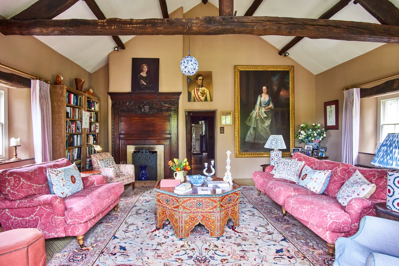
Similarly at home, furniture may be vintage, but it’s far from twee. There’s not a hint of French shabby chic. In its place, there is a Swedish twist – cue the painted Gustavian cabinets that the couple have collected over years. Throw in a touch of Tangier with the Moorish ottoman in the living room (found on eBay) through to the striped ticking fabrics that are used as door curtains or sofa throws all over the house, and you have a decorating masterclass on learning to layer.
For instance, take the cosy sitting room in the oldest part of the house. In this room, hand-dyed yellow linen blinds are paired with silk ikat lampshades, and a chair is upholstered in red linen from Pierre Frey with blue piping. These are all by textile designer and interior decorator Susan Deliss, who had a hand in many of the textile goings-on. The ottoman is from Robert Kime and the striped jute log basket is from Maison Bengal.
Other than the tiny dining room, which is painted in Farrow & Ball’s India Yellow, neutral walls are the foundation. “If you took away the patterns, the rugs and the paintings, the decoration is plain underneath,” Simon explains. “I think we’re moving away from bold-coloured rooms where the furniture is almost a secondary thought.”
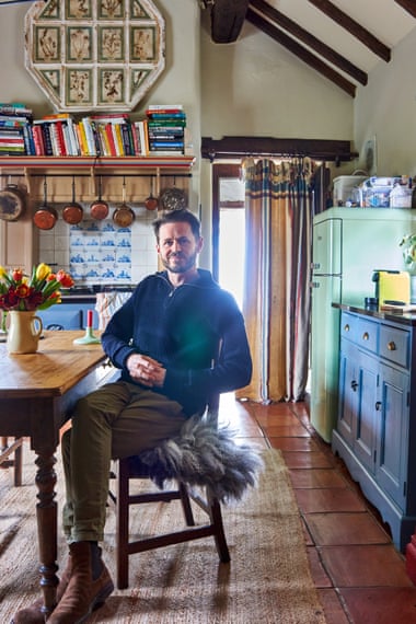
Objects are cleverly grouped. An expression of their stylish selves, a statement piece, such as the green dresser from Framlingham antique dealer Dix-Sept in the kitchen was the starting point, with accessories in a multitude of prints and supporting colours, bringing the whole room together in a lively mix.

“We didn’t want the units to be all the same colour,” Simon says of the introduction of red and blue to the palette, which took more than 40 tester pots to get right. “The red in the kitchen makes it feel warm in winter, whereas the blue adds freshness during the summer.” The cream-coloured walls hold everything in place.
Walk into the expansive, light-filled drawing room at the opposite end of the house and there is a shift in mood – less snug farmhouse, more elegant country house. Patterns work in harmony, with jewel-toned pinks and blues a recurring colour pairing and the walls painted a sandy brown – Chocolate by Edward Bulmer Natural Paint. The sofas have been upholstered in curtains repurposed from a previous home.
“We loved the process of doing it up,” Simon recalls. Jeremy, who was head of content at Mr Porter for the best part of a decade and is due to launch his own skincare brand, is renowned for his taste and is an expert at object placement. Two creatives working together… this is a very stylish home-making team.


