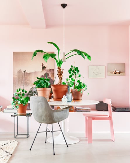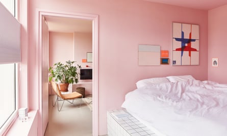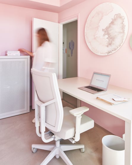
Chantal Assinck took the decision to paint almost everything in one arresting hue when she and her partner couldn’t have the concrete walls, ceilings and kitchen they’d originally envisioned for their apartment. “I couldn’t find the perfect product at the right price for all the surfaces, so that’s when we decided to paint everything one colour,” explains Chantal as she describes the pink apartment in Arnhem, the Netherlands, that she shares with Tom and their dog, Eddie.
The home is also decorated with distinctive pieces from local designers, such as Studio Erik Stehmann whose decoration piece “Showpik” hangs over the kitchen island; there are family heirlooms and even furniture that she’s built herself. But it hasn’t always been pink – they started with dark green and it will soon change to blue, they’ve decided. “All things are replaceable and changeable,” Chantal says. “I don’t think I’m really attached to most of the things we have, but if I had to sell all our stuff, I would make sure to at least keep the Wiggle chair by Frank Gehry. It was given to me by someone who is like a mentor-friend-second mother to me.”
The 1950s apartment was devoid of any character when the couple bought it. After it was damaged by a fire in the 1990s, none of the original architectural features remained. While this left them with no real architectural barriers, it also left a lot to be desired.
The space was mostly empty and outdated. It had been renovated after the fire, but the proportions didn’t make effective use of the space. There were several small, disconnected rooms and an entrance hall which was far too big for the couple.
“We wanted to create an open-plan living and kitchen space in a way that we could incorporate as much of the beautiful views of the nearby Eusebius church as possible, without limiting the practicality of the rest of the apartment,” says Chantal, who owns the location agency Mucking Afazing.
The couple wanted a bigger bathroom and managed to double its size by expanding into the hallway. They decorated it themselves using Winckelmans tiles, which they bought secondhand and via a wholesaler. The removal of the wall between the kitchen and living room established the open-plan concept they wanted, and there’s now natural light coming in from both sides.

“If the apartment had still been in its original state when we bought it, we wouldn’t have been able to make all of these changes, because the building and this street has been designated as a municipal monument,” says Chantal. The local council wants to keep apartment buildings in this street intact because there are very few left from the 1950s reconstruction of the city, which was severely damaged by the Battle of Arnhem during the Second World War.
In the living area, Chantal made the sofa herself and used Hornbach tiles to cover the side tables, and the platform for the bed in their room was also a DIY creation. “I love to experiment and I’m very visual,” she says. “I’m always looking at colours, forms, materials and how to combine them.” She tries out different compositions using the furniture and objects they already have, changing the layout frequently.

Chantal had been planning to install a poured concrete floor, but it would have been too heavy for the ceiling of the apartment below them. “We looked for an alternative, which took us quite a while. However, the solution was simple and cheap.” A self-levelling, 4mm-thick concrete screed mix floor was laid instead. The colour differs in certain places and you can see bubbles because of the way it was wiped down to finish. Over the years it’s become more worn with cracks and marks, but this doesn’t bother the couple. “We like the raw touch it gives our apartment,” says Chantal. “Not having skirting boards also means you still see the imperfections on the lower side of the walls and the edges of the floor. Tom and I are not aiming for perfection – we like it when things look a bit unfinished.”
They designed the kitchen and had it built by an acquaintance. “We undertook the rest of the finishes, including tiling, painting and some joinery.” The couple even managed to incorporate a bar in the modest apartment, which they’ve also painted pink. It’s their favourite space to relax with friends. Positioned next to the window in the kitchen, it offers the picture-perfect view of the Eusebius church that Chantal had imagined when she first arrived. “Just like the apartment that evolves as I reconfigure the interiors, this window gives us an ever changing outlook of the beautifully coloured skies all year round.”


