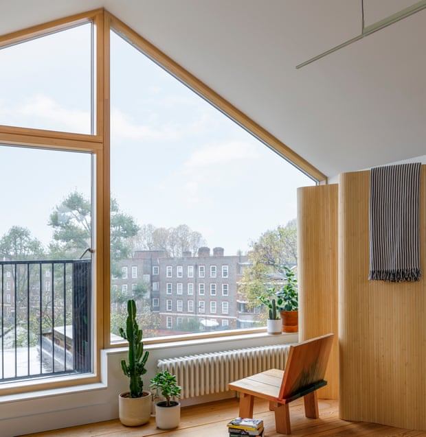
We never actually wanted to live in a Victorian terraced house,” says Shay Alkalay, owner of an 1860s Victorian terraced house in north London. “It’s a bit strange for us coming from Tel Aviv. The houses here are generally so dark and narrow with ugly features – and carpeted.” But a complete transformation in the hands of Shay and his wife, Yael Mer, co-founders of the award-winning design studio Raw Edges, means their house is now an invitingly open and light-filled family home.
The house, which the couple bought four years ago, was ripe for renovation. “We used to live in the Barbican in London, which felt a bit like being in Tel Aviv, full of Modernist architecture. When it came to designing this place, we wanted the interior to reflect that,” says Yael who, along with Shay, moved to London 18 years ago to study at the Royal College of Art. “Our aim was to make our home modern, bring as much light to the space as possible, level the floors – really make it work for family life.” The couple have two daughters, Neeva, 11, and Maia, seven and a cockapoo called Ami.
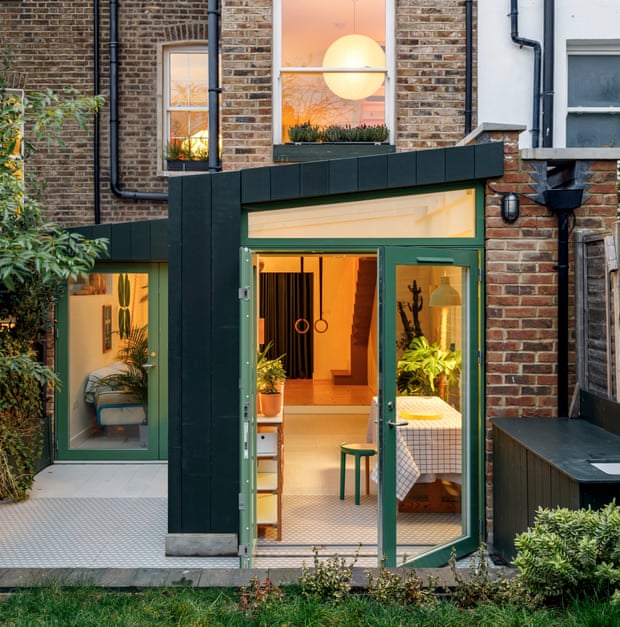
The first step was stripping away unnecessary internal walls and detailing – “The ground floor was originally three stepped rooms” – extending the lower ground floor towards the garden and then building a spectacular loft. “Inspiration came from British Modernist architecture and the industrial interiors of schools and hospitals,” says Shay.
The front door now opens directly into an open-plan kitchen and dining area with cosy corner seating for reading and socialising. The expanded lower ground floor is the kids’ domain, complete with a disco ball suspended from the ceiling, gymnastic rings and a pull-down projector for family movie nights. “The girls and their friends can make as much mess as they like and we don’t have to see it,” says Yael. The first floor houses the girls’ bedrooms and a family bathroom, and the newly built top floor is a suite for Yael and Shay. Every floor has more or less uninterrupted front and back aspect glazing, so light flows through the house.
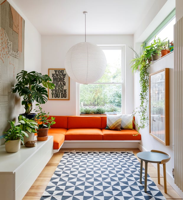
What makes the place particularly special is the sense of the couple’s hand in everything. “We have a workshop in our studio, so it seemed obvious to do as much of it ourselves as we could,” says Shay. “There were quite a few weekends spent sitting in the garden gluing MDF and Lino.”
There’s the built-in corner seating on the ground floor upholstered in orange Kvadrat wool, a large wall-mounted shelving system on the lower ground floor, which uses adapted Ikea units, hidden storage near the front door for everything that gets dropped by kids and, most impressive of all, is the couple’s own bed on casters on the top floor of the house. “It’s part bus stop, part princess bed,” says Yael. “We didn’t want any curtains to block the views from the top floor, so we enclosed the bed with curtains instead.”
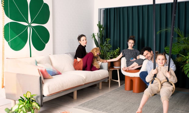
The white walls throughout the house, painted in Dulux White Cotton, prove the ideal backdrop for Yael and Shay’s plentiful use of colour. The kitchen is a happy mix of red and green cabinetry and a wall of ceramic tiles they’ve designed for Mutina, which work perfectly with bright yellow Jasper Morrison chairs for Vitra and their DIY Lino-topped dining table.
The house is welcoming and practical yet full of surprises and it is fun. Alongside products they’ve designed for brands, such as the light fixture for Louis Vuitton above the dining table, rugs for Gan, a sofa for the British startup Cozmo, or the Stack shelving system for Established & Sons in their bedroom, the house offers mostly humble, industrial materials and fittings. There’s Lino across the surfaces of simple plywood shelving units, timber flooring and concrete walls. Even door handles and basin taps are from school suppliers, inspired by their daughters’ primary school.
Are they pleased with their first interiors project? “Yes, but being the designer makes you feel like you can always change things. I’ve been trying to convince Yael we should move the kitchen downstairs.” Yael is not convinced. “I’ve said, in the next place everything can be on wheels so when Shay wakes up in the morning and wants to move something I can say, ‘Cool, just push it.’”


