
When Nikki Lindman viewed this apartment in south-east London, she was more than ready for a fresh start. “I was in the final stretch of a very long divorce,” she says. So this two-bedroom home, which also needed to shrug off its recent past, felt like a perfect match.
The building was constructed for a leather company at the end of the 19th century, when this area was a centre for tanneries rather than hipsters, and the word artisan didn’t refer to a loaf of bread.
But when she bought it, the flat’s aesthetic wasn’t working for her. “It was decorated in a slick bachelor pad style,” says Lindman, who works in advertising. “The bedroom was matt black, the hallway was painted in a Blu Tack grey and the bathroom was tiled in a brown and gold baroque pattern.” What’s more, the bones of the building – the Victorian bricks, steel beams and old tiles – were largely hidden behind panelling and, despite the large Crittall windows, the spaces felt dark and devoid of life.
However, Lindman had an inkling that beneath the MDF boxing and fitted carpets lay some interesting features waiting to be discovered:
“On my first viewing, I spotted the edge of some ceramic tiles behind the cladding.” They weren’t the decorative or floral tiles usually associated with the Victorian era, but a more utilitarian design that reflected the building’s working past. This was precisely what Lindman wanted to tap in to.
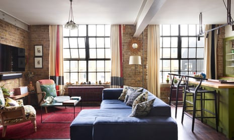
She also wanted to inject colour into the spaces and change the layout, so brought in London consultancy Howark Design. One of their biggest changes was to the existing kitchen, which was “like an office galley kitchen where you’d make the coffee or heat up a microwave lunch”.
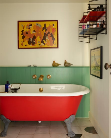
The team moved the kitchen so that it’s now part of the open-plan living and dining space, creating custom carpentry in olive green and a central island with a shimmering copper worktop. The old kitchen area was used to enlarge the bathroom, where vivid colours – a postbox red on the bathtub and mint green (Arsenic by Farrow & Ball) on the woodwork – create an upbeat mood.
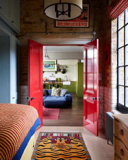
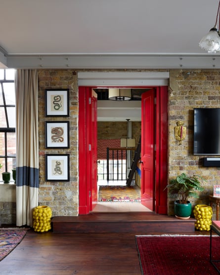
Another blast of colour comes from the double doors dividing the living area from a guest bedroom, repainted in a glossy red that reminds Lindman of her childhood homes. “I was born in Singapore to Scandinavian parents, and in every home we lived in, the front door was painted red,” she says.
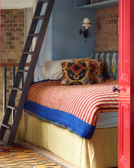
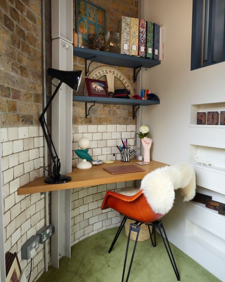
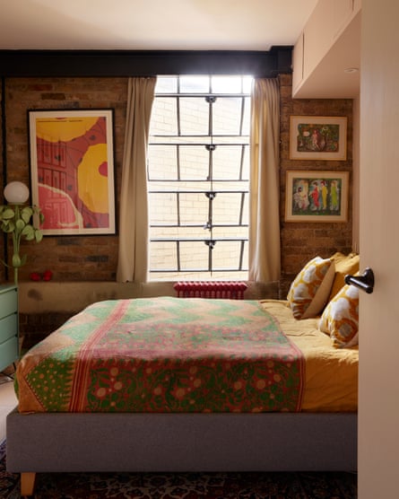
The guest bedroom is a tricky shape – long and thin with a staircase at the far end leading down to a small, seldom-used area. “This was previously used as a dressing room, and had a vast wardrobe and a mirror framed with LED lights – all a bit fancy for me,” says Lindman. Howark Design suggested retaining some of the cabinetry, but using it as a frame for a day bed that can expand into a double. The area at the foot of the stairs is now a neat study with a built-in desk and shelves that hug the newly revealed curved wall.
-
Double doors painted red frame the living room, with the green kitchen beyond; the guest bedroom has a ladder up to a mezzanine area used for storage, as well as a study with built-in desk
There’s a more expansive feel to the main sitting area, with a low and louche Living Divani sofa that Lindman bought for her previous home.
“It was a tall Georgian townhouse, so I had to find a sectional design that would fit through the doorways and narrow hall,” she says. “I loved the sofa, but it always looked out of place there. Here, it immediately looked at home and visitors gravitate towards it.”
Vintage rugs from Afghanistan, Turkey and Morocco help define the dining, seating and entrance areas of the open-plan space.
“It’s a tradition in our family that when you move house you get given a rug, so I have quite a few,” Lindman says. She inherited her love of rugs and fabrics from her parents, who travelled a lot and lived in south-east Asia for many years.
“I have strong childhood memories of being taken around old bazaars and markets,” she says. “My parents would be served coffee and I’d sit and wait, surrounded by towers of rugs, breathing in the spice smells of the market.”
-
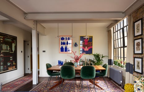
The dining area, with a table by Matthew Hilton for De la Espada and Gubi chairs also has a painting by Francesca Van Haverbeke, left, and a vintage Polish circus poster from 1977
Lindman’s apartment now expresses her personality, but stripping it back its layers has also revealed the building’s character. “Before, this flat was in denial about its true identity. Now it feels true to its Victorian roots, but with a modern twist.”
This home features in Victorian Modern by Jo Leevers and Rachael Smith (£30, Thames & Hudson). To support the Guardian and Observer, order your copy at guardianbookshop.com. Delivery charges may apply.