Bill and Hayley Kingston bought their atmospheric house in Kent in 2017. Originally an Arts and Crafts schoolhouse built in 1902, it was in a poor state of repair. Divided into two residential properties during the 1970s, its interior bore little resemblance to any original layout. But Hayley had a clear idea of how it could look and hired architects to help realise her vision.
“It had an odd identity and didn’t seem to know what it was, but the fact that it wasn’t a standard semi-detached house appealed,” she recalls. Hayley was creative director of Den Creative, the digital agency she and her husband founded together before she stepped back to put more time into raising their children after the third was born. It was then that working on the design for the house became her creative outlet. Nowadays the family comprises Etienne (10), Sylvie (8) and Astrid (3), plus Dusty the dog and Mittens the cat.
The family were living just down the road when they decided to upsize. Planning took a year and the build a further 12 months. They reinstated walls so the proportions made sense. “We knew we were gunning for a large open-plan extension, so it made getting rid of some of the open-plan aspects in other areas a much easier decision,” says Hayley. In fact, Etienne’s bedroom turned out to be the only room in the house in which all four walls remained intact.
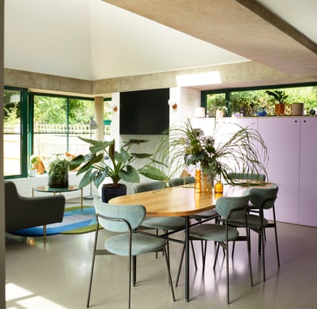
The architects designed curves and a vaulted rear extension, creating a unique and eminently livable space to which Hayley has added graphic pops, playful statements and 1960s aesthetic elements. Whitewashed brickwork and a stunning Brazilian quartzite kitchen island sit alongside accent pieces, including artworks and modernist furnishings, tied together by Hayley’s extraordinarily bold colour and visual sense. “We found the quartzite stacked in a field in Essex at Granite Slabs UK. They said no one ever chooses that one!”
Hayley was keen to avoid a box with bifolds, wanting the new space to be sympathetic to the old house, though acknowledging it was a later addition. A combination of old and new is where they landed. Externally the traditional brickwork and tiles were matched to the original, and the vaulted roof is a nod to local oast houses, but green steel windows maintain a visual connection into the garden, with modern exposed concrete to disguise the steel supports.
Choosing French doors and windows rather than bifolds means Hayley can open a window to allow the air to flow, but not a small child out. The window seat lets them take in garden views, keeping an eye on cooking and kids. Striking houseplants ensure greenery does not halt at the door, and the feel is that of an orangery.
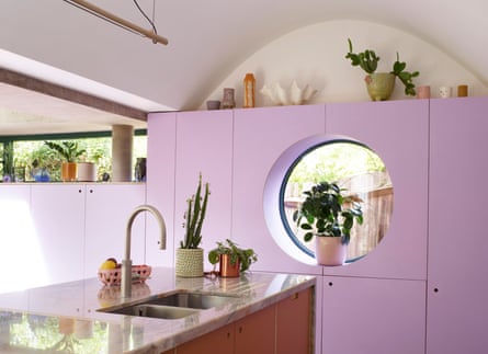
The architect suggested the Arts and Crafts-inspired barrel-roll ceiling. Taking their cue from its curve, they introduced a porthole window and arched doorways. Choosing the colour scheme throughout was a matter of learning to trust her instincts, bolstered in confidence by a session with colour consultant Jean Macdonald, as Hayley first At first Hayley erred towards sombre tones. “I thought I’d go with Tanner’s Brown from Farrow & Ball for the kitchen units, but soon realised I was just trying to be sophisticated.” Instead, she chose orange and pigment-rich purple from Lick paints. The cooker is by La Cornue, and Hayley spray-painted the bar stools lilac. The kitchen tap is Quooker, and a carpenter was commissioned for the cabinetry.
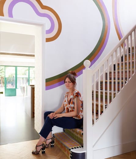
A starting point for the scheme was the striking Martin Brouillette painting in the living room, informing Hayley’s colour choices for the rest of the house. The rainbow mural was a unique way to continue the cohesive story: “All the colours used are ones from the various rooms; I designed the layout and hired a talented local painter,,” says Hayley. In the kitchen and living room she chose white for the walls, allowing the brighter colours to sing and ensuring a connection between the two, but she painted the living room’s ceiling down to the dado rail in Farrow & Ball Pink Ground.
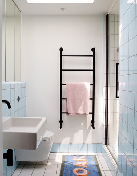
The ceiling light is by houseof.com and the pink chair from Oliver Bonas. Pink continues upstairs and down – one bathroom has a pink concrete sink, another pairs pink walls with green swimming-pool tiles, and taps are black throughout. “The black taps were my least successful choice, as the black wears off in parts and shows the brass.” The original floors were plain concrete so, inspired by the neighbouring property, they installed parquet.
Charity warehouses in France were a frequent haunt and produced interesting finds, such as the light in Sylvie’s room and chairs and pots on the landing. The French Alps are a special place for the couple, as it’s where they first met and where Bill later proposed. “Bill’s love of the mountains means he is drawn to natural earthy tones, and the green in our bedroom was his choice,” says Hayley.
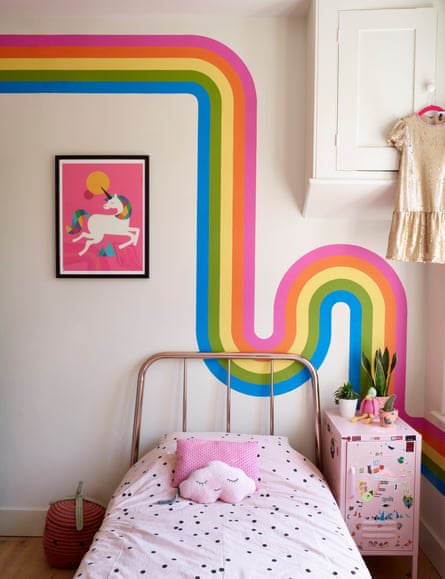
A painting in the bedroom of Bill’s father’s old house where he grew up was given a pink frame. When Etienne requested the mountains as the theme for his bedroom, Hayley enjoyed the challenge, and his bed represents a sunrise. The rainbow mural takes pride of place in Sylvie’s room, but Hayley had firm ideas on a background colour – F&B’s School House White.