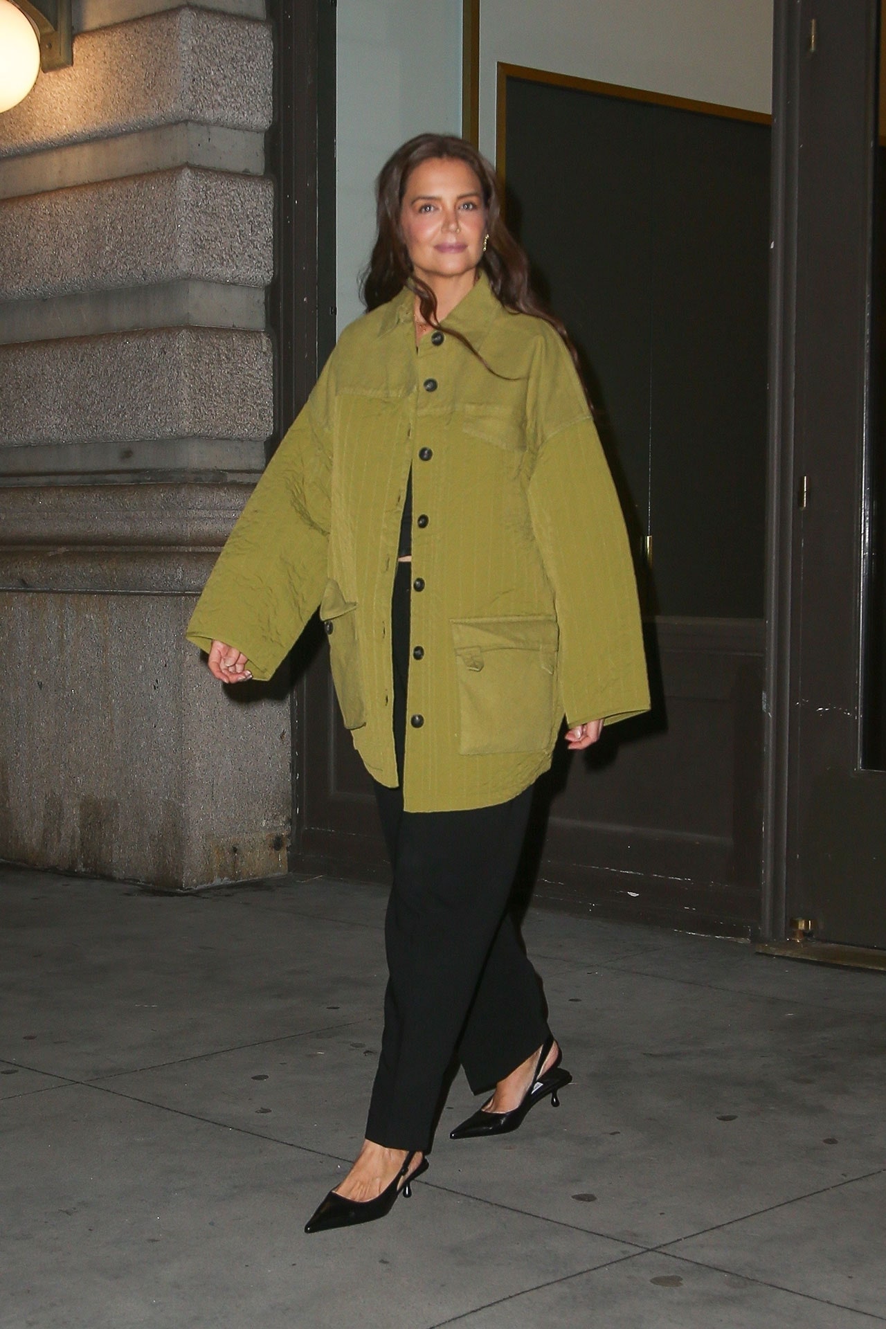
Katie Holmes stepped out in New York on March 20 in vibrant shade of green, which made us wonder: Is the actor dabbling in color analysis?
Over the past couple of months, color analysis has emerged as the latest way to demarcate your identity online, with thousands of Instagram Reels espousing the benefits of having your “colors” professionally read. Ie: visiting someone’s living room and paying them hundreds to tell you to avoid wearing red if you have zits.
Much like Harry Potter houses, star signs, or Myers-Briggs tests, there is perhaps some (some) truth to color analysis. But the whole thing ultimately rides on an outdated idea that the primary function of your wardrobe is to be as “flattering” as possible: a tool to smooth over perceived flaws, as opposed to, I don’t know, wearing clothes that make you feel interesting and cool. “What ‘suits’ me has never been a driving force in how I get dressed. I am an emotional, inexplicable dresser who is driven by my heart,” wrote the journalist Laura Antonia Jordan, as she reflected on getting her own colors “done” back in February.
I’m not sure whether Katie Holmes has seen this TikTok video, in which someone describes the actor as a “shaded soft summer,” but she has regardless found a color—a sort of olive green—that looks pretty good on her bronzed-up skin. (For what it’s worth, the actor also looks great in mint green, sage green, lime green, and seafoam green.) Holmes wore a quilted, utilitarian jacket in that precise olive hue while dining in New York last night with wide-legged trousers and sling-back kitten heels. Proof, perhaps, that it takes a little more knowledge than a 1930s Bauhaus color wheel to be a successful dresser.
This article first appeared on British Vogue.


