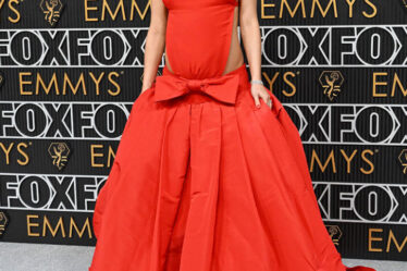

Prints are among the trickiest things to style. You want to look like you’re wearing the pattern and not that the pattern is wearing you—and that comes down to acing the scale, colors, and sizing of the piece of clothing it’s on. However, you also need to select the right pattern to begin with. Of course, prints are fickle things that move in and out of the trend cycle quickly: One day, stripes are all the rage, and the next, they look dated. But there are a few that look drab no matter what. Keep reading to learn the patterns personal stylists avoid for their aging effect.
RELATED: 10 Shoes That Are Making You Look Older.
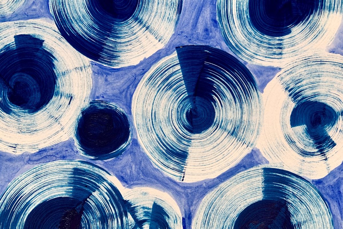
You’ll know an abstract print when you see one: They typically have bright colors and swirly shapes. Elizabeth Kosich, certified image stylist and founder of Elizabeth Kosich Styling, says they can be tough to pull off as we get older.
“Simply put, the ultra-modern aesthetic makes a mature person look like they’re trying too hard,” she says. “Abstract motifs also tend to be bold in shape, scale, and color, which quickly overpowers and drowns out the wearer.”
If you throw on a maxi dress with this print, it could easily become the only thing people notice about you.
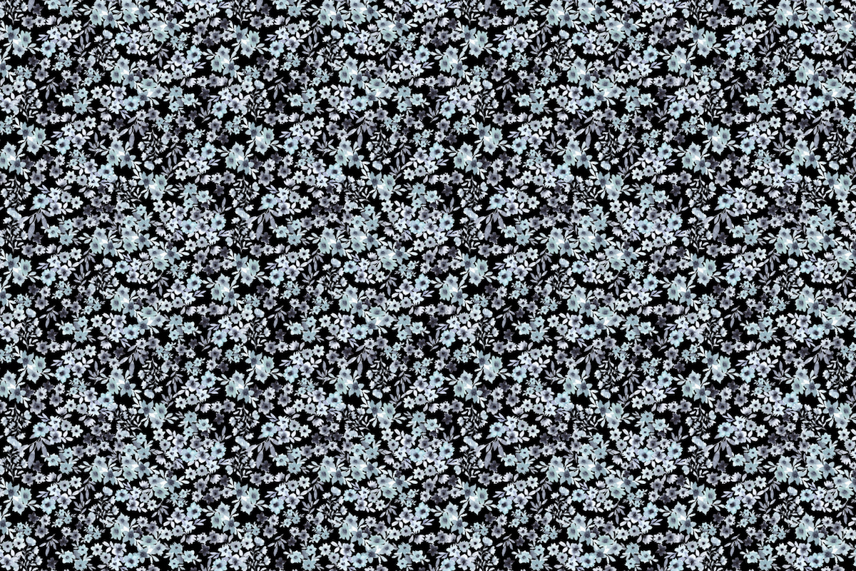
Ditsy prints are typically tiny florals scattered randomly across a piece of fabric. They’re common on sundresses and tank tops, as well as sheets, sofas, and blankets.
“Professional cowgirls notwithstanding, ditsy prints don’t look appropriate on anyone over age 25,” says Kosich. “The sweet and innocent motif reads young and girly, which doesn’t suit a grown-up’s image. Not only does it send the wrong message, it’s a disconnect when it comes to personal branding.”
If you’re into florals, choose a pattern in a medium scale.
RELATED: 8 Clothing Items That Make You Look Dated, Stylists Say.
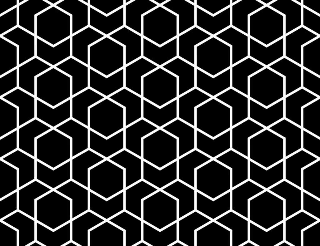
These patterns are big and bright. “As we age, our contrast softens, making it tougher to carry bold patterns like geometrics,” says Kosich.
“The striking shapes and angles can also appear too harsh, plus the color pairings are often more intense and high contrast than our own,” she adds. When that happens, it can make people miss your personal features for those of your clothing.
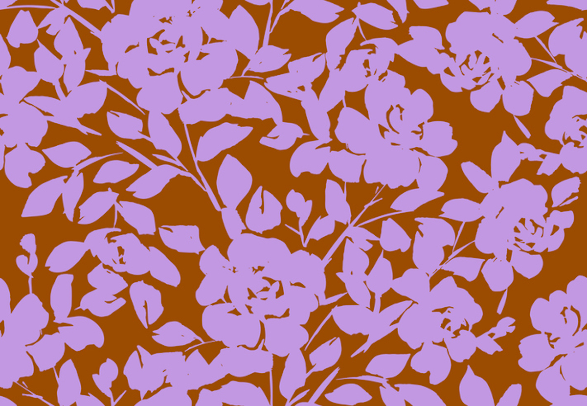
Similar to micro-florals, large-scale ones can also have an aging effect—especially prints with a vintage or overly busy aesthetic, says Yenia Hernández Fonseca, stylist at Margo Paige.
“Large florals can create a cluttered visual effect, which may come across as outdated or matronly,” she says. “Also, big floral prints project a more conservative or traditional image, which can age you beyond your years.”
If you want to try them, Hernández Fonseca suggests pairing them with more modern accessories, like jewelry, a bag, or a jacket.
RELATED: Wearing These 5 Colors Can Age You, Stylists Say.
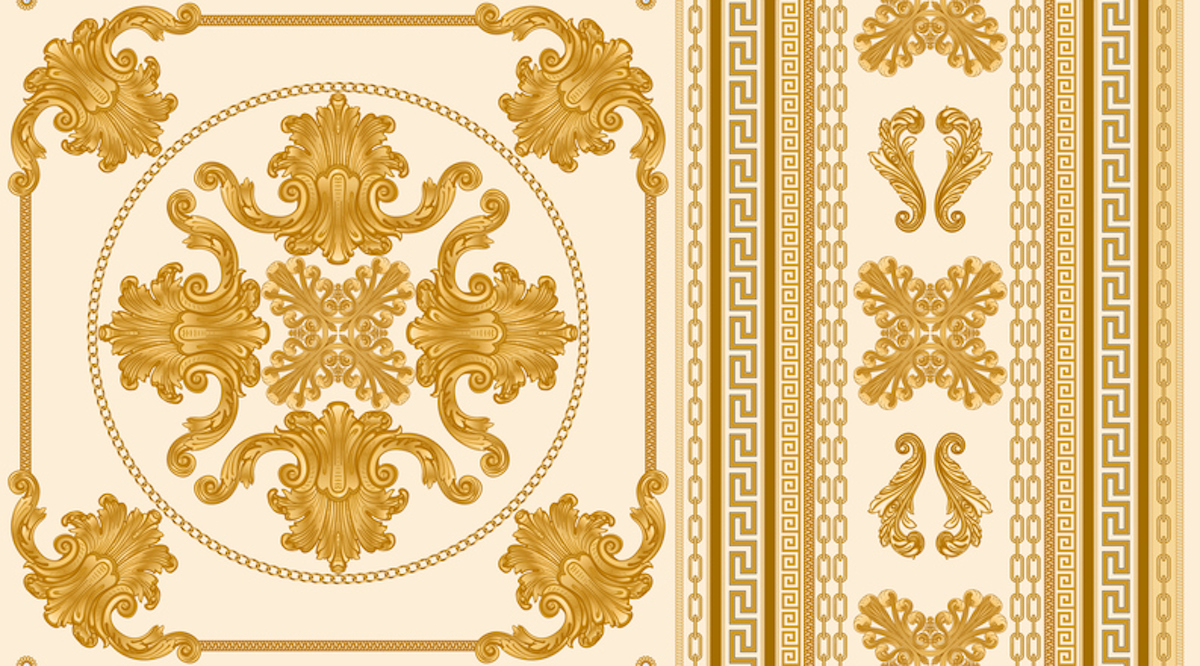
Gucci and Versace made baroque prints popular, but you can see them at stores across the country.
“All-over baroque prints are too ornate and overpowering, especially with repeating patterns,” says Hernández Fonseca. “If you’re a fan of baroque, opt for an asymmetric print with a balancing negative space around the subject to achieve a better composition.” It’ll feel a little less overwhelming.