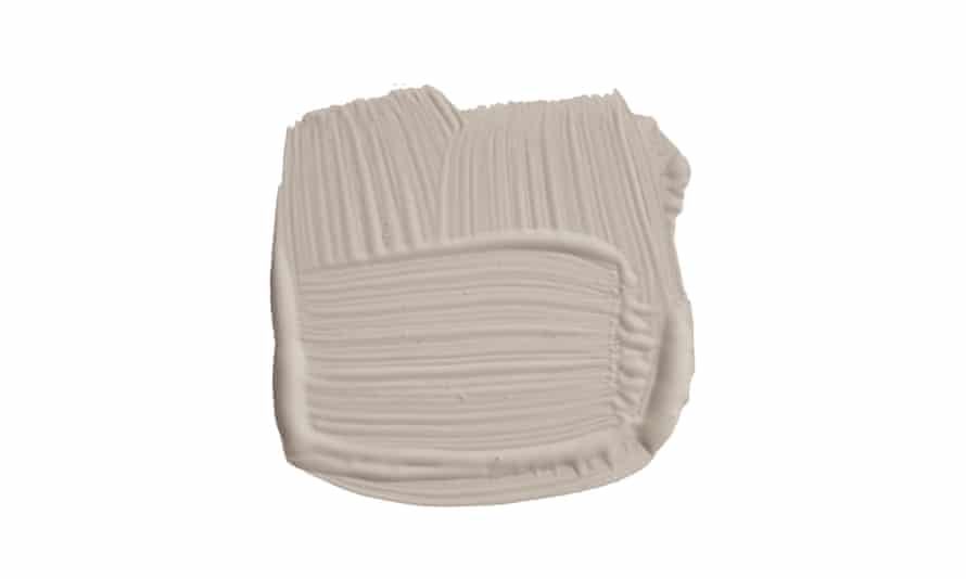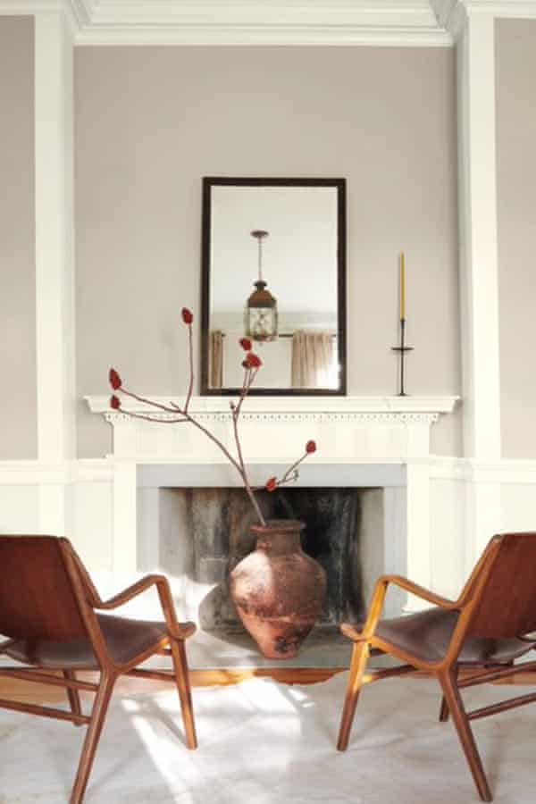
You might say it’s charcoal, silver, concrete, slate. You might call it by the name on the paint chip: Chic Shadow, Polished Pebble, Purbeck Stone. Or you might say it’s greige. Whatever you call it, the prevailing interior design trend of the past decade has been shades of grey.
Elephant’s Breath – described as an “uplifting” mid-grey, with a hint of magenta – has been called a paint color of the decade in the UK, ranking among Farrow & Ball’s top 10 shades for the past 12 years and inspiring numerous spin-offs.
In the US, Revere Pewter, an “iconic neutral”, has likewise been a consistent bestseller for Benjamin Moore since the mid-2010s. Sherwin Williams’ top 50 colours, meanwhile, span from beige to dark grey but mostly split the difference with a rich spectrum of greige.
Across houses and offices, in bedrooms and living areas, grey has emerged as the go-to neutral paint shade, and often – as real estate listings reveal – an entire aesthetic, with wall-to-wall grey surfaces and furnishings.
But these desaturated spaces in many ways contrast with the times. Over the past decade of social media, our interiors have come to be seen as an expression of who we are. Not only is society more individualistic than it was 10 years ago, it’s more polarized.
So why do we persistently reach for these drab, midrange shades? The answer is not black and white.
Indeed, says the British art historian James Fox, author of The World According to Colour, there is no such thing as a neutral color: “Only what a given society agrees is neutral,” he says. “But if you step outside that society, or look back through history, you realize that everything is ideological in some ways; everything is a stylistic choice.”
“Neutral” might be best understood as “dominant,” says Fox (whose own house in Hackney, London, is painted in Dulux’s Pebble Shore, a sandy grey “with a touch of khaki”). From the late aughts, grey began to displace bright whites and creams as the preferred palette for interiors to become, in the 2010s, as ubiquitous as “magnolia” – a buttery yellow-based white – was in the 1980s and 1990s.
But the origin of this great wave of grey goes back through centuries of western culture to a longstanding prejudice against bright colors, as explored by the artist David Batchelor in his 2000 book Chromophobia.
Goethe’s Theory of Colors, published in 1810, maintained that bright colors were suited to children and animals, not sophisticated adults; this view was shared by great artists and thinkers throughout history from Aristotle and Plato to Le Corbusier and Cartier Bresson.
Still today, words such as “lurid” and “garish” have negative connotations. “Color is often represented as feminine, or Oriental, or primitive, or infantile, rather than grown-up and philosophical and serious … and it’s clearly indexed to issues of race, culture, class and gender,” says Batchelor.
Yellow in particular has fallen out of favor in recent decades, associated with defeat and age; “the color of bile and urine,” says Fox.
Even cream is now too much for us to stomach; it is regarded in the world of interiors as “white that’s gone off”, Fox says. It seems no coincidence that it began to curdle in the late 1990s, as Ikea started to crack the US and UK markets with its sleek, hard-wearing take on modernism.
The UK, in particular, started increasingly to look to Scandi style after decades of chintzy prints, then Mediterranean jewel tones and terracottas. The scene was set for grey to take over from cream as a similarly livable colour, with a great diversity of shades but a sobriety more appropriate to the times.
“Refined taste is associated with a desire for the muted, the minimal, the sparse,” says Fox. Over the past 15 years, “what we have seen is a move from the yellow end of the spectrum to the cooler one – from beige, to greige”, amounting to what Fox calls “a desaturating effect” across culture.
This doesn’t apply to interiors only: compared with the caramel-washed sitcoms of the 90s, today’s television shows and films are graded to a greyish “sludge”. Apple, meanwhile – perhaps the defining brand of the past century – abandoned its candy-coloured iMacs and iPods post-millennium in favour of clean lines of chrome, glass and “space grey”.

Another defining 21st-century brand, Kim Kardashian , embodied the shift. Soon after she started dating Kanye West in 2011, she famously threw out her wardrobe of bright prints to become the monochrome muse of the past decade, influencing fashion, beauty and even interiors.
In 2016 Architectural Digest pointed to Kardashian’s tonal style in support of painting grey walls; her own LA mansion is almost exclusively ecru. Such a coordinated décor might seem labour-intensive, the mark of a professional stylist, but greys are relatively forgiving. Fox says it is because they are naturally occurring in fabrics and textiles, lending them a “protean, amorphous” quality: “They can adjust to all sorts of environments, they do well in the light and the shade, and they seem like they have been around a long time.”
Multipurpose and timeless-seeming, grey makes the perfect backdrop for a fast-fashion generation more likely to refresh their home with new accessories than a professional redecoration.
“That’s what I love about the color greige: it’s such a great base,” says Jasmine Young, 30, who shares her Dorset home (complete with Elephant’s Breath walls) with 45,000 followers on Instagram. “If you want to bring in color, you can easily change up the look through cushion covers or a throw.”
From vintage to modern aesthetics, to dark and light woods, chrome fittings to natural fibres – greige “literally works across all interior styles,” says Young. In this way it is like a real-life Instagram filter, using color not to express your individuality but as a consistent backdrop for it.
Fox notes the irony: as our politics and culture have become more extreme, our palette has become more muted – and “just as we are being driven apart, our homes are becoming more similar”. In his trendy area of London, he says, nearly every front door is painted in Farrow & Ball’s Railings, a not-quite black, “and most people have Elephant’s Breath on their internal walls”.
But it extends far beyond Hackney, as the 15,500 photos hashtagged #elephantsbreath go to show. Indeed – like reclaimed wood, industrial fittings and other hallmarks of what has been termed “International Airbnb Style” – grey walls have become a global signifier of generic “good taste”.
It is this unambitious, anodyne aesthetic – like looking at a perfectly curated Instagram grid – that depresses Batchelor, author of Chromophobia. Avowedly opposed to neutrals, he is unpersuaded by arguments that greige contains subtle depths: “You can have a colour chart that says ‘bland’ and stick it all under that,” he says with disdain.
“It’s all so safe, that’s probably the most dispiriting part of it: it threatens nothing and no one, apart from with a slow, unadventurous death.”
But even Batchelor admits that he prefers to live in a neutral environment mixing brick, ceramic tiles and white (“my wife is a chromophobe,” he says). Since the mid-2010s especially, people have sought not to be energized by their homes – but soothed.
“Everything in the outside world is so chaotic. I like to come into a place and immediately feel the calmness,” Kardashian told AD in February 2020.
Through the pandemic, this took on a premium. Rebecca Wilkins, 29, moved into her first home in Birmingham in February 2020 and painted its cream walls grey. “I just like living in a neutral home, any color makes me uneasy,” she says – even her dog, she adds, is grey.
But the uncertain times were also a factor: “I don’t know if I would have been so focused on being in a calming space if I wasn’t in my home so much.”
Allow Instagram content?
This article includes content provided by Instagram. We ask for your permission before anything is loaded, as they may be using cookies and other technologies. To view this content, click ‘Allow and continue’.
Wilkins does occasionally fantasize about painting one wall pink, “but I want the house to just flow, so probably not”. Instead she has contented herself with replacing the cool greys of her “neutral home interior” – followed by 60,000 people on Instagram – with warm ones.
Fox, too, has noticed a recent shift towards the yellower end of the spectrum. Changing Rooms’ Laurence Llewelyn-Bowen has even threatened the return of magnolia.
It is a tentative sign that the blanket of grey over interiors is starting to lift. “People are being a little more brave with colours,” says Hannah Yeo, color marketing manager at Benjamin Moore. She singles out a return of red, orange and yellow – and not just for accents. “The classic red dining room is coming back.”
So, too, are Apple’s colourful computers, with the iMac recently relaunched in seven colours. It suggests that post-pandemic people are prioritising not serenity in their homes, but joy.
Neutrals will always make up the majority of paint manufacturers’ bestselling shades, says Yeo, and she does not foresee grey, “an essential colour”, ever going away entirely. But it might increasingly coexist alongside brighter hues. This year’s colour trends are those that inspire levity, she says: “I think people are yearning for that. We’ve been all greyed out.”
Canadian colour consultants The Paint People recently reached the same conclusion, declaring on YouTube “the death of greige: a paint colour category that has absolutely dominated interior design for well over a decade”.
What will replace it, they predicted – and also Benjamin Moore’s colour of the year for 2022 – is a light, silvery green. Or, as they called it: greeneige.


